article thumbnail

How to Layout a Pediment: 350 years of instructions

Jane Griswold Radocchia

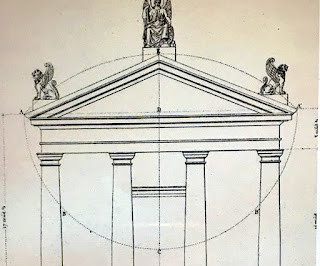
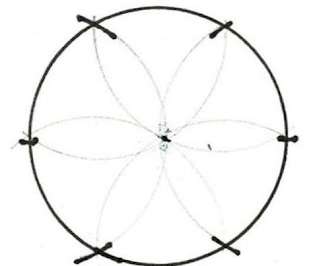
The diagram shows the actual twine held tight at Points A and B. Perhaps Gibbs includes the knowledge of this diagram when he writes that his 'draughts. I began my diagram here on the lower edge of the pediment's frame. The 2 small diagrams on the right side Plate XVII are his codification to Vignola's Rule.

Diagram 52
article thumbnail

Eugene/Architecture/Alphabet: O

SW Oregon Architect

Olive Plaza (my photo) This is the next in my Eugene/Architecture/Alphabet series of blog posts, the focus of each being a landmark building here in Eugene. Many of these will be familiar to most who live here but there are likely to be a few buildings that are less so.

Insiders

Sign Up for our Newsletter

This site is protected by reCAPTCHA and the Google Privacy Policy and Terms of Service apply.

article thumbnail

James Gibbs' steeples

Jane Griswold Radocchia

Below each steeple on Plates 29, 30 and 31 are diagrams, the plans for each steeple, showing the outlines of each steeple part. This is the diagram for the middle steeple which was copied for the Baptist Meetinghouse. The parts layer one on the other following a diagram, a pattern - which I refer to as the square and its circle.

Diagram 97
article thumbnail

Not enough density next to transit

Brandon Donnelly

He also writes a blog. So here’s what a 500m walking radius looks like around Bloor-Dundas West and its two closest subway station neighbors: The important thing to pay attention to in this diagram is all of the yellow that falls within each radius. ” This, as we have talked about many times before, is essential.

Diagram 69
article thumbnail

Calm down, Dubai

Brandon Donnelly

” I have spoken about this report many times before on the blog because I generally find them really interesting. Knight Frank just published the 17th edition of its annual “The Wealth Report.” So today I’d like to share two items from this latest one.

Diagram 52
article thumbnail

The compactness of Paris

Brandon Donnelly

This is a great diagram from Smart Density comparing the urban and regional rail networks of Toronto, London, and Paris. I have said this before on the blog ( here , here , and here ), but I will say it again: There seems to be a tendency to fetishize the scale and height of Paris. All are at the same scale.

Diagram 40
article thumbnail

A4 Spotlight: : Innovations in Sustainable Energy

A4 Architects

Green Hydrogen Diagram Another exciting and interesting area of research is “Green Hydrogen.” Heat Pump Diagram The path to a sustainable future for the world will need to overcome many political and engineering challenges, but the stakes are too important to fall to act decisively.