Deconstructing Power: W. E. B. Du Bois at the 1900 World’s Fair
Cooper Hewitt, Smithsonian Design Museum
New York
Through May 29
It has been almost five years already since Princeton Architectural Press published W. E. B. Du Bois’s 1900 Paris Exposition data portraits as a visually riveting paperback. After public release in digitized form by the Library of Congress and in various printed color formats in a number of magazines, it would seem that the data portraits had been given their due. Graphic designers oohed and aahed over the cutting-edge modernity of the data portraits and their prescience in terms of data visualization. Important social science labs even commissioned Du Bois–styled presentations of 21st-century data.
Deconstructing Power: W. E. B. Du Bois at the 1900 World’s Fair, currently on view at Cooper Hewitt, invites us to consider the data portraits in the material context of the 1900 world’s fair in Paris. This exhibit highlights the role of the data portraits, even though they formed only a part of The Exhibit of American Negroes in Paris. The full American Negroes exhibit was a collaboration of W. E. B. Du Bois and journalist Thomas J. Calloway with the Library of Congress. Within that collaboration, archives credit the data portraits to Du Bois and his team of students. The focus at Cooper Hewitt is not Du Bois’s techniques of abstracting complex information toward data visualization. Rather, the exhibit positions the data portraits as design artifacts, comparable in modernity to other technical and material artifacts exhibited in Paris, from a moving sidewalk to cabinets and tables.

I appreciate many aspects of this curatorial shift. It opens a way to consider the data portraits as co-inventors of modern design. The data portraits portray a national identity in data so expansively and precisely that they do warrant consideration as design—not only graphic design but interactive data design, exhibition design, and storytelling. This becomes one way of rescuing the data portraits from sheer visualization and the fetish of graphics. The precision and creativity of these data portraits do the work of depicting a people and, in doing so, counter the colonial, circuslike mode of representation at the world’s fair.
Through this exhibition, we can see the Calloway–Du Bois works as a precursor to contemporary notions of structural racism. I am thinking especially of geographer Ruth Wilson Gilmore’s definition: She defines racism as the power to inflict premature death. Gilmore’s definition complements the Du Boisian sociological obsession with statistics and lines. If the exhibit title implies that the Paris Expo both consolidated and distributed the power of nation-states and colonial economies of production, then Du Bois’s works here would be the agents of deconstruction.
The deconstructing aspect of the curatorial narrative has some hairy moments, though.
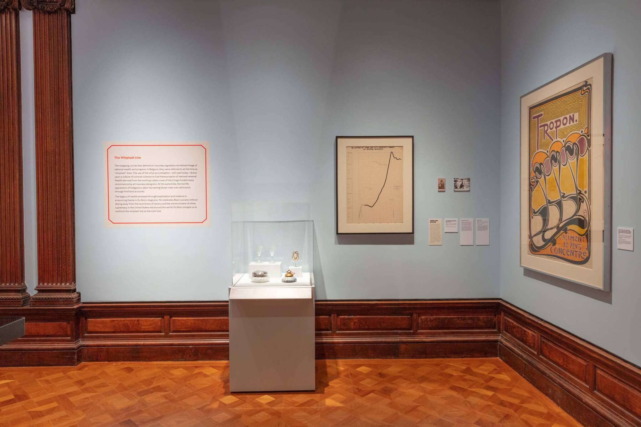
In a didactic way—through wall texts and close juxtapositions—the exhibit attempts to imply a link between Du Bois’s rendering of the color line and the spline curvature of art nouveau design. This “whip- lash” spline, as the exhibit calls it, signals design’s extraction of colonized labor in the form of luxuries consumed in the colonies. It is a bit of a tortuous line of association, almost as prone to bending and curling on itself as the wrought iron and graphics that the argument references.

The most cringe-inducing moment of this argument in the exhibit is a corner grouped together by what the wall text terms “visualizing violence.” Here two framed works on paper almost meet in a corner. On the left hangs a Du Bois data portrait titled VALUATION OF TOWN AND CITY PROPERTY OWNED BY GEORGIA NEGROES. On the right is a poster titled Tropon, designed by graphic designer Henry Van de Velde in 1898. The poster is an advertisement for a diet supplement made from egg whites and historically significant as an instance of art nouveau graphic design. In the corner between these two works are two tiny mounted images, printed smaller than the foam-core rectangles that display the wall texts.
The curatorial associations here are attenuated, but they seem to rely heavily on the photo that the exhibit’s wall text titles Escaped Slave Gordon. The Gordon image comes from one of a set of daguerreotypes of enslaved African Americans taken at the behest of Harvard professor Louis Agassiz in 1850. This photo has been worked on extensively by Black artists and art historians, foremost by artist Carrie Mae Weems and Sarah Lewis. Weems repurposed a set of Louis Agassiz photographs, including especially this one of Gordon, to stage questions about photography, authorship, scientific knowledge, the gaze, and the Black body.
Agassiz’s intention with the image series was to “prove” the inferiority and weakness of Black survivors of enslavement. This commitment to a scientific representation of the disposition of Black life toward death and extinction preceded Darwin’s theory of natural selection. It is in Agassiz’s set of images that one can see that the fundaments of social Darwinism—the search for a scientific representation of Black inferiority— in many ways preceded Darwin’s biological theory of natural selection.
This may seem like a tangent, but it is not. Installing the Agassiz daguerreotypes adjacent to Du Bois’s data portrait counters and undoes the data portraits so intensely that it threatens to revoke and undo every other achievement the exhibit makes. Encountering this corner feels like bumping against the one convoluted lie that makes you doubt everything your dream lover has shared with you. It is jolting, but not
in the way the curators seem to imply. It is through the scarred marks on Gordon’s back that the curators want to imply a visual and material connection between the data portrait and the egg white poster.
Let me pause and unpack this:
Do the curators really think that Du Bois and his team fudged the data on lynching so that the line would look like a whip in midair?
Or:
In the midst of all these modern techniques of measurement and orthographic abstraction and color coding, do the curators want us to think that Du Bois planted the image of the whip for some kind of rhetorical or metaphorical purpose?
Or:
Are the curators positing that violence against the Black body was so pervasive in the era of early globalization and industrialization that the means of violence could be read into pretty much anything? Like a kind of semiotic haunting—a geometric ether that whips Black bodies?
Any of these possibilities leads toward a dead end. The curators ask us to either discount the realm of data integrity in the Du Bois project or invite such a level of abstraction about anti-Black violence that white supremacy can be presumed to be naturalized and absorbed into every mode of representation and design. This would make white supremacy naturalized and reified far beyond the potential to deconstruct it.
Part of what makes this so bizarre and disappointing is that the curators have collected incredibly poignant snippets of context about the preparation of The Exhibit of American Negroes. For instance, to highlight the 1899 lynching of Sam Hose as context for the 1900 exhibit creates powerful parallels with design activism today. The Exhibit of American Negroes in the curators’ narrative needed to respond to both the violence of lynching and the “slanders” attempting to justify the violence.
Calloway and Du Bois collaborated to counter the recurrent material facts of pre-mature death and the faux science circulating to justify such violence. Their data, then, highlight Black life and Black thriving. They make legible the patterns that tie poverty to illiteracy or link violence to loss of property. The 1900 exhibit also included bound collections of photographs of Black social life and Black space, photographs that are noticeably absent from the Cooper Hewitt’s exhibit.

The curatorial frame, however, seems to stage a dialogue between Du Bois’s data research and commodity formalism that invites us to doubt the ethics of our own pleasure. The exhibit’s juxtapositions and wall texts focus on the nexus of Europe, colonialism, and modernity, where the spline curve allows design to be fetishized and superficial, masking issues of labor and hoarded capital. This history of the spline is interesting, but it misses the mark for this exhibit. This ambitious curating around the “whiplash line” misses significantly in terms of who the presumed viewers are and what the role of formalism might be in circulating awareness of both premature Black death and the dignified beauty of Black lives. In juxtaposing the data portraits with colonial design pieces, the curators seem to want these data narratives to do pan-African work, without acknowledging Du Bois’s own journey with pan-Africanism.
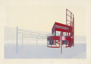
Some of what’s oddly lacking is evident in the curators’ summary text: “For the first time,” the show brings these data narratives “into dialogue with the manufacturers and decorative arts also on display, calling attention to how the progressive image of the fair was inequitable, and concealed the power mechanisms of nationalism and imperialism that drove this spectacle of progress.” I think they mean for the second time, since the first time would have been at the 1900 fair itself. Do the curators mean to imply that Du Bois himself was indifferent to the manufacturers and decorative arts on display? But the exhibit includes a fleeting photograph of Du Bois’s 1900 exhibition design. Look at this intensely layered and haptic exhibition display system that Du Bois and his team designed. If this is not a predecessor to Microsoft Windows, hyperlinked browsers, and data compression, I do not know what would be.

Also consider the perfection of the line work in the data portraits, the absence of smudge, the precision of the curves. The red coil of CITY AND RURAL POPULATION, 1890 looks like a high-tech machine about to whir off the page.
Despite these misalignments, there are snippets of archival brilliance that speak to the approach that an institution such as the Smithsonian can bring to this work. The color line is a kind of recursive double—both a justification for racism and an outcome of racism. The bending of the color line charts the inflection of events on the data path of Black lives. The care of researching and drafting those lines entangles with the infinite and even aesthetic ways that Black lives matter.
Mitch McEwen is principal of Atelier Office, a cofounder of the Black Reconstruction Collective, and an assistant professor at Princeton School of Architecture, where she directs the architecture and technology research group Black Box.