Thonik creates colourful visual identity for Hong Kong's M+ museum
Dutch design agency Thonik has created a visual identity for the M+ museum in Hong Kong featuring a range of vibrant colours influenced by the city's architecture and neon signage.
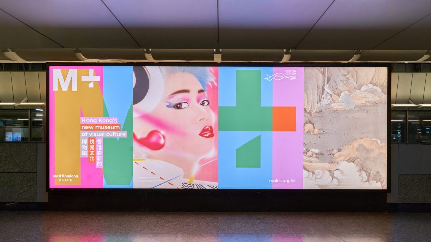
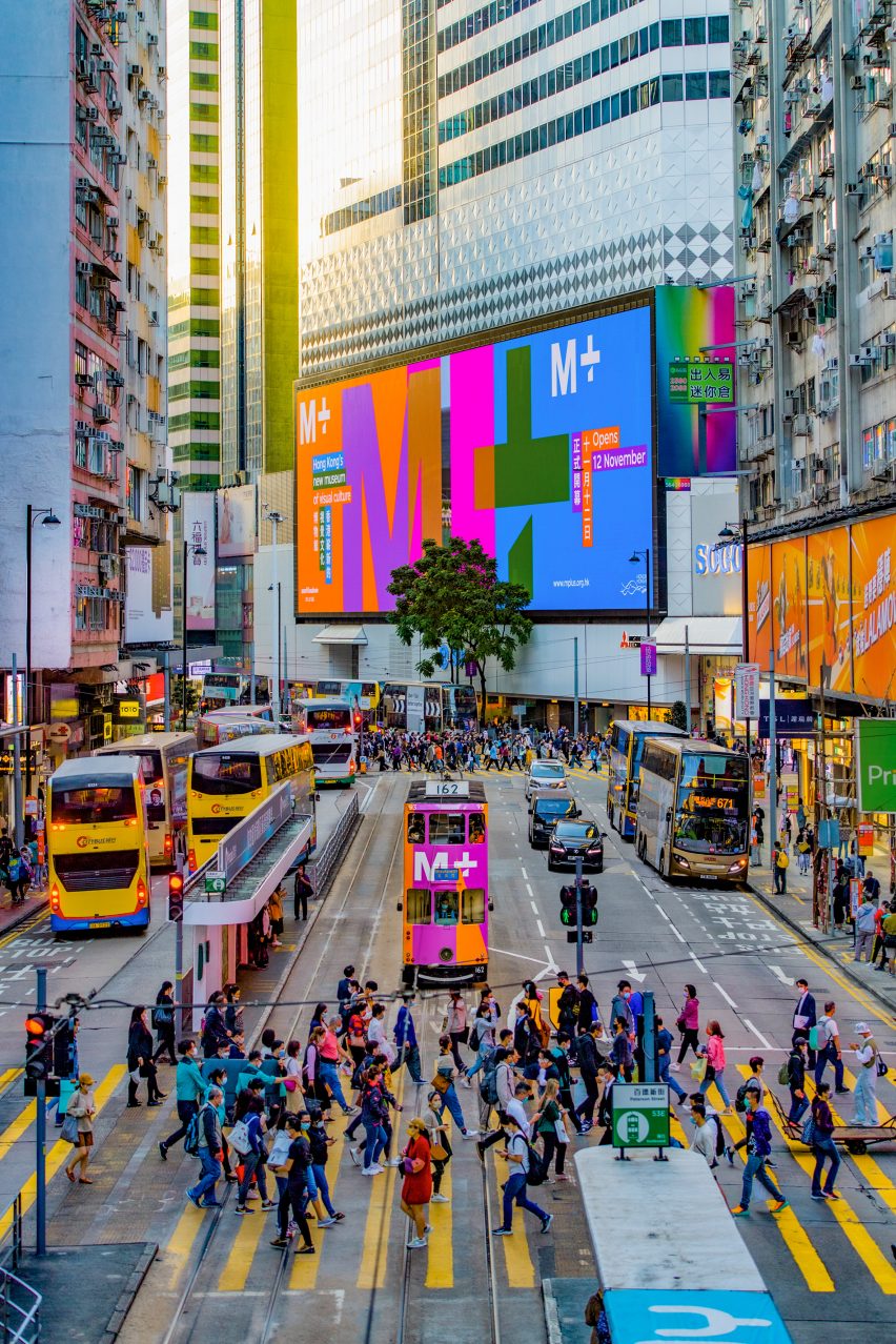
The integrated design system by Thonik will be used for the museum's online, offline and onsite communication.
Used in conjunction with a logo designed by British design firm North, the identity is intended to be recognisable, practical and representative of the institution's intercultural focus.
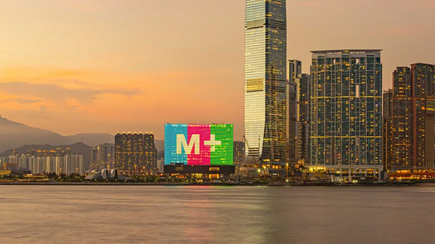
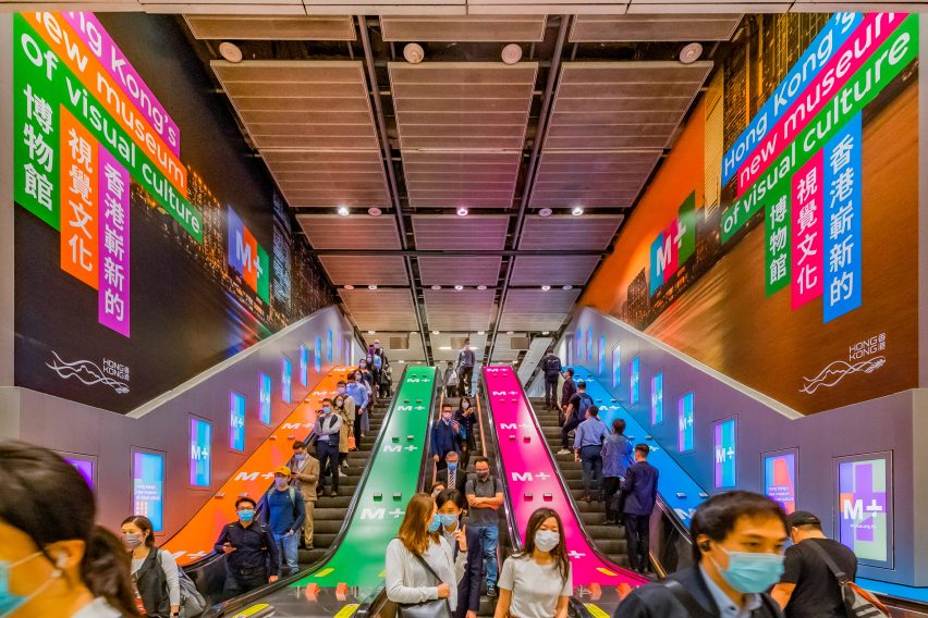
The project, which is shortlisted in the graphic design category at Dezeen Awards 2022, uses a range of mid-tone colours that recall Hong Kong's urban fabric, including the neon signs and screens used by advertisers.
"A unique colour concept bridges vibrant green, blue and orange with softer tones and grey," the studio explained.
"It is a conceptual colour set that fits the vibrant neon colours that are so typical for Hong Kong with the grey of high-rises of the big city."
The colour palette is produced by combining red-green-blue (RGB) hues with 50 per cent black to create tonal consistency.
This technique means that when the resulting colours are used as backgrounds for text, black or white lettering will always be legible.
"The colour concept is connected to the optical science of the workings of the human eye," said Thonik, which was also influenced by the experiments of the colour theorist and Bauhaus teacher Johannes Itten.
"Scientific, conceptual and human-centred, the identity fits to the core of the museum's vision and to the architecture and the specifics of Hong Kong."
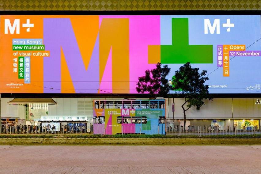
The identity project connects the museum's facade, the website, social media platforms, wayfinding and a promotional campaign involving billboards and other forms of outdoor advertising.
The concept is applied to printed materials including maps and guides, as well as to a special M+ product line sold in the museum's shop.
The M+ museum of visual culture was designed by Swiss firm Herzog & de Meuron and completed in 2021. The building's facade features a large, integrated LED screen, which is visible across the harbour in the West Kowloon district.
The M+ identity is one of two projects by Thonik that feature on the graphic design shortlist at Dezeen Awards 2022. The other is a new identity for Dutch Design Week, which features lettering that evokes a stylised tulip flower.
Thonik is an Amsterdam-based collective led by designers Nikki Gonnissen and Thomas Widdershoven. The studio specialises in visual communication, graphic identity, interaction and motion design.
The photography is courtesy of Thonik.