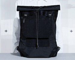
Brand identity for traditional chinese medicine
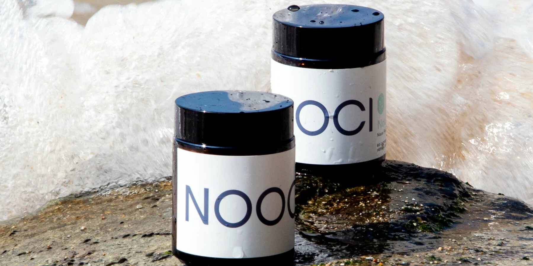
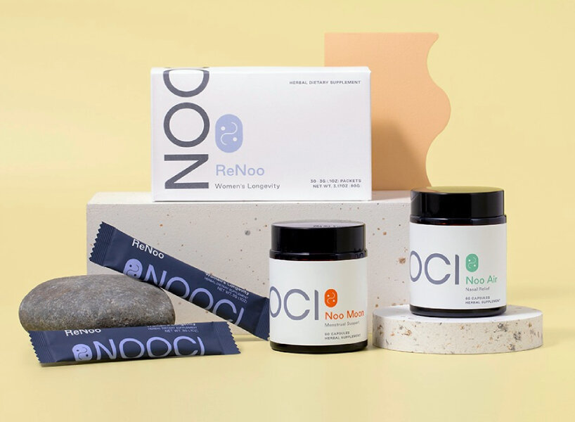
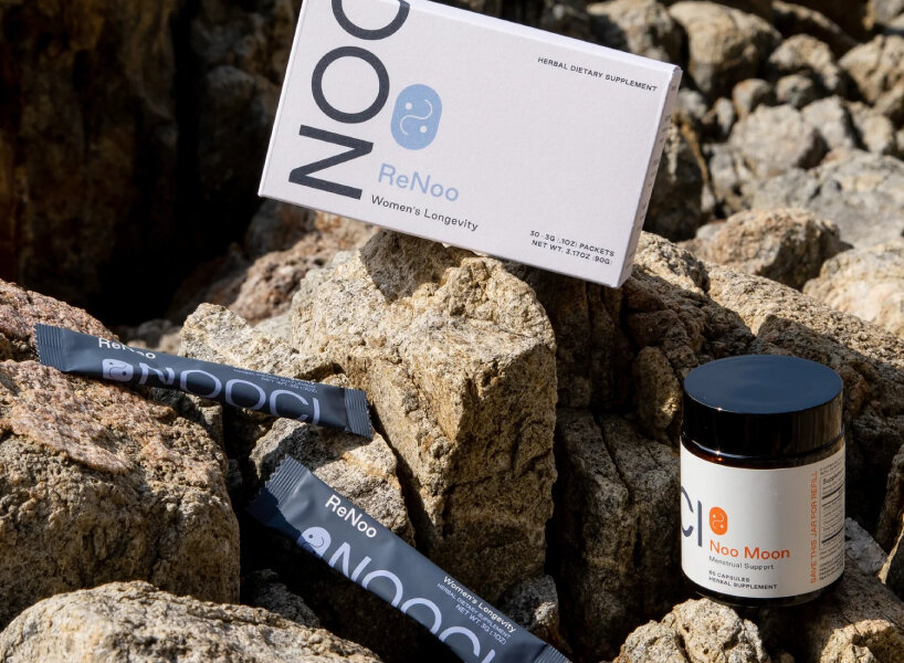
To underline the decades-old practices of traditional Chinese medicine, supplements company NOOCI tapped creative agency Smakk Studios to redefine its brand identity and packaging design, gifting the design earth and soft palettes, a sans-serif typography, and reusable glass containers for recycling to align with the modern pull toward minimalism and eye-catching brand sakes. The creative agency modernized the traditional symbol of Yin and Yang from its black and white theme to gentle colors such as pastel purple and blue-green with two white dots and a white swerving line. The sans-serif typography is an ode to the growing appeal of the simplistic design, and pairing it up with minimal texts across the product containers makes the overall look clutter-free.
The creative agency also collaborated with NOOCI on the product naming – ReNoo, Noo Air, and Noo Moon – to tie them in with the brand’s identity. The product names correspond to what the supplement offers. Green or barley tea ReNoo enjoys a deep-purple packaging design and attempts to rejuvenate the well-being of the clients by stimulating their metabolism, combatting bloating, boosting immunity, lowering sugar craving, and maintaining healthy skin and youthful aging. The pills of Noo Air – a non-drowsy herbal formula that helps alleviate common symptoms caused by nasal allergies – are placed inside a reusable glass jar, strapped with a white label and the now signature mark of NOOCI, the revamped Yin and Yang. Capsules of Noo Moon – a daily supplement to support menstrual cycles – are also locked in a glass jar, but saturated orange marks its labels and signs.
images courtesy of NOOCI
Retaining the nuances to the typical products
Having Smakk Studios work on NOOCI – whose profile has developed brands within the industries of health, wellness, beauty, personal care, fashion, lifestyle, food, and beverage – means the supplement company’s character veers from the common designs of traditional Chinese medicine which often embody scripts over scripts and overlapping colors. Smakk Studios sought to retain the nuances of these typical products found in the market while instilling NOOCI’s philosophy of ingredient traceability. The supplement company writes that it sources its ingredients from around the world, accumulating herbs, spices, and components such as Perilla Leaf, Reiki Mushroom, Fermented Soybean, Jujube, young Barley Grass, Acerola Cherry, and Beta Carotene.
When NOOCI founder Stephanie Tan was pregnant with her second child, she struggled to find balance as she juggled being a mother, wife, and entrepreneur. Coupled with her allergies acting up, she lacked sleep and felt anxious most of the time. She says she was eager to find a more natural solution, given that she was pregnant, and stumbled upon traditional Chinese medicine as an alternative. She read up on its practices – from alleviating sleep and mood swings to help with seasonal allergies – and consulted university professors and integrative medicine specialists to put forward NOOCI. She writes that her supplement company was born from a desire ‘to educate and share with other women the incredible benefits of TCM, so they too can see the powerful part it can play in a sustainable healthy lifestyle.’
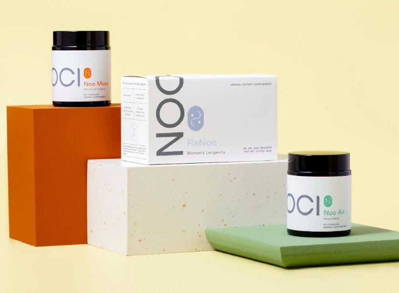
soft tones, sans serif, and glass jars modernize NOOCI’s traditional chinese medicine
Catering to the new society’s design demands
The creative agency claims that consumers are demanding more and that smart brands are rising to such a challenge. The team writes that every day, in increasing numbers, consumers are showing up for brands that prioritize sustainability, inclusion, authenticity, self-expression, health, safety, and social impact. ‘Brands that commit to making a positive impact can win the future,’ the company writes. In response to the design tastebuds the consumers seem to crave, the creative agency work on building and developing brands that cater to the modern buzzwords. ‘We’re on a mission to change consumer behavior towards purchasing decisions that are better for people and planet,’ writes Katie Klencheski, the founder of the creative agency.
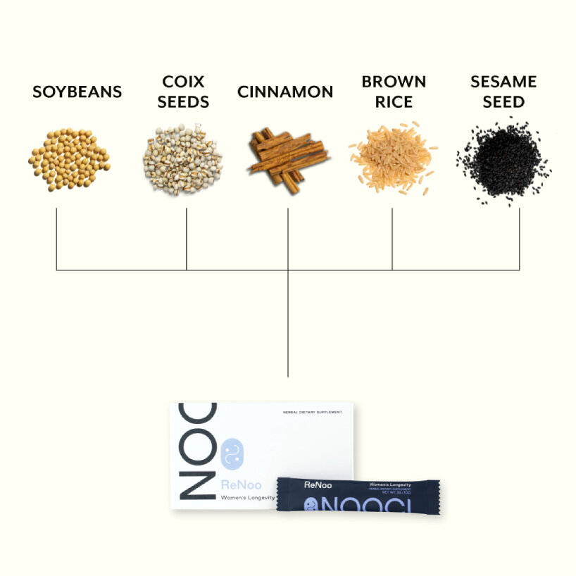
some of the ingredients of NOOCI’s products
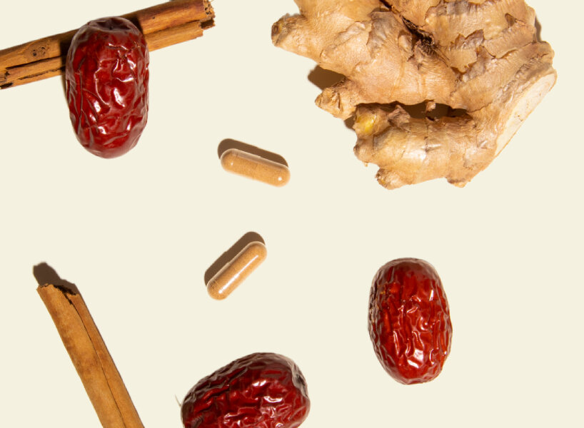
raw ingredients of NOOCI
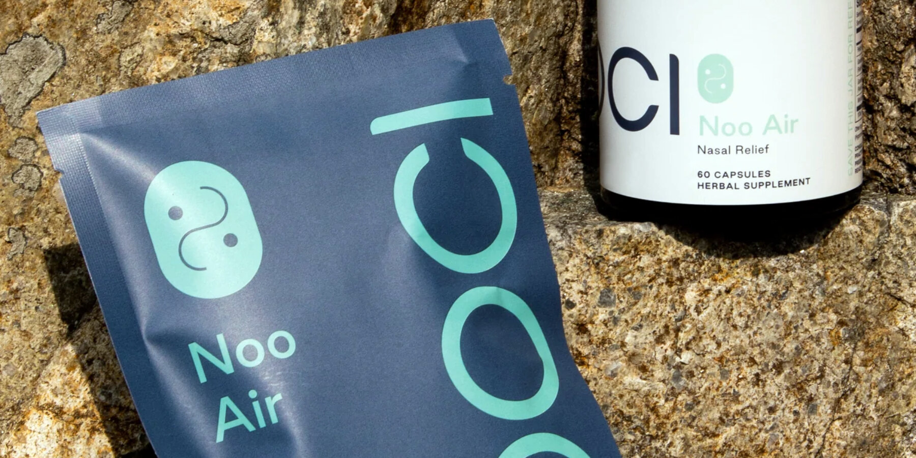
soft tones, sans serif, and glass jars modernize NOOCI’s traditional chinese medicine

ReNoo green or barley tea
packaging design of NOOCI
project info:
name: Brand identity for NOOCI
designer: Smakk Studios
client: NOOCI
packaging design (100)
 Feb 14, 2024
 Nov 13, 2023
 Nov 10, 2023
 Oct 16, 2023
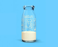 Oct 13, 2023
recycling (330)
 Apr 25, 2024
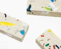 Apr 23, 2024
 Apr 19, 2024
 Apr 16, 2024
 Apr 16, 2024
typography design (133)
 Sep 13, 2023
 Feb 23, 2023
 Jan 24, 2023
 Jan 19, 2023
PRODUCT LIBRARY
 Apr 17, 2024
 Apr 15, 2024
 Apr 15, 2024
 Apr 12, 2024