Architects: Want to have your project featured? Showcase your work through Architizer and sign up for our inspirational newsletters.
Few things impact us in the way that color does. Within our daily lives, it is often the first thing our eyes are drawn to, particularly when that color is bright, bold and at scale. We use color as a reference and a descriptive marker, “the red shoes,” “the golden archways, “the black turtleneck” each description conjures iconic images that are drawn upon because of their color. Color is an effective medium of expression. When used consciously, color and tone kindle atmosphere and emphasizes shape and form, ultimately influencing our emotions and reactions.
Still, the general attitude towards color in architecture is one of hesitation and reluctance. Apart from education and healthcare settings — places that generally embrace color as a tool for support and emotional wellbeing — color is usually reserved as add-ons to architectural settings: signage, advertising, furniture, ornaments and the people occupying the spaces with their clothing.
However, these incredible A+Award winners and finalists prove that there is nothing to be frightened of when embracing the bright and the bold. They have used their projects to showcase how color can elevate our architecture and brighten our increasingly monochrome landscapes.
Plus X
By Studio Egret West, Brighton, United Kingdom
Popular Choice Winner, 2021 A+Awards, Coworking Space
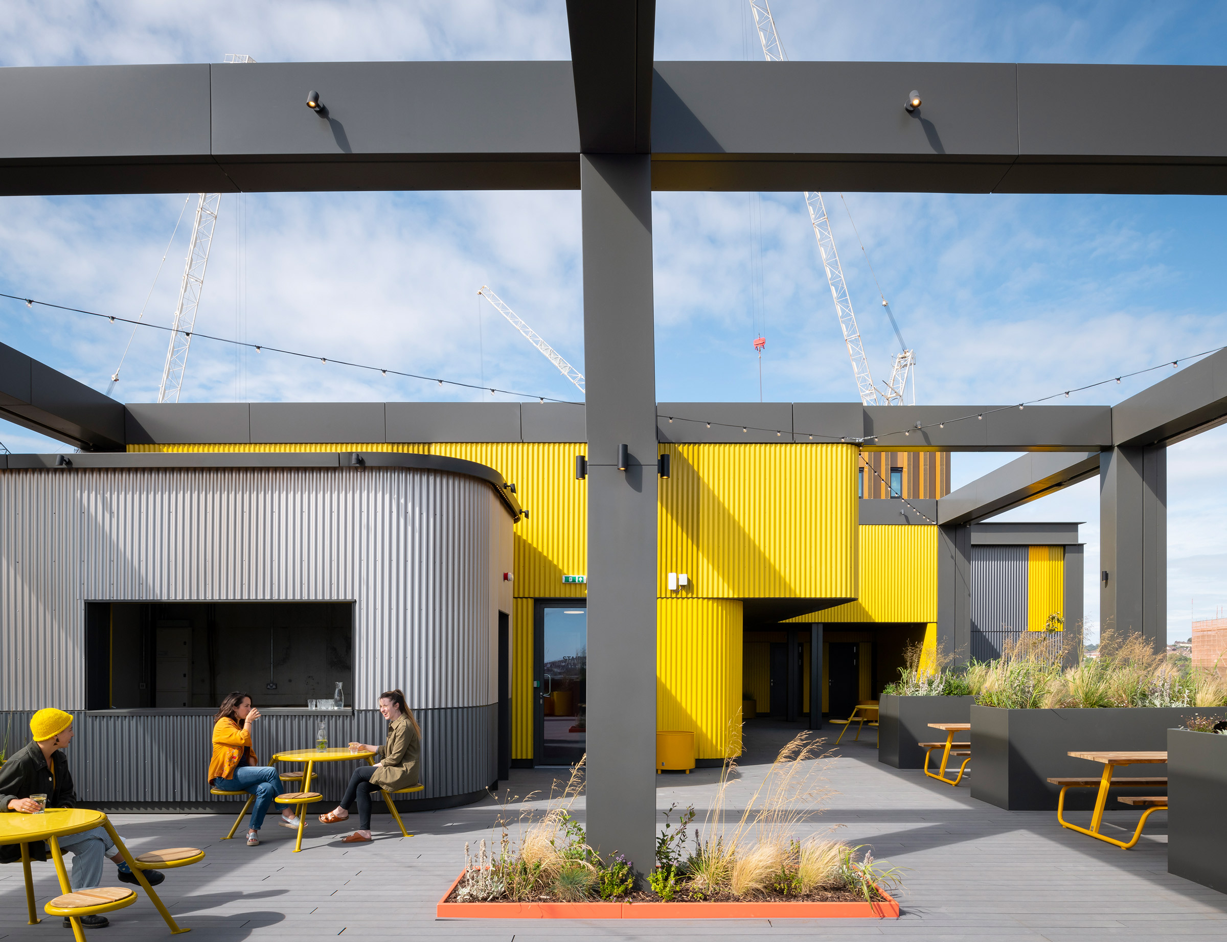
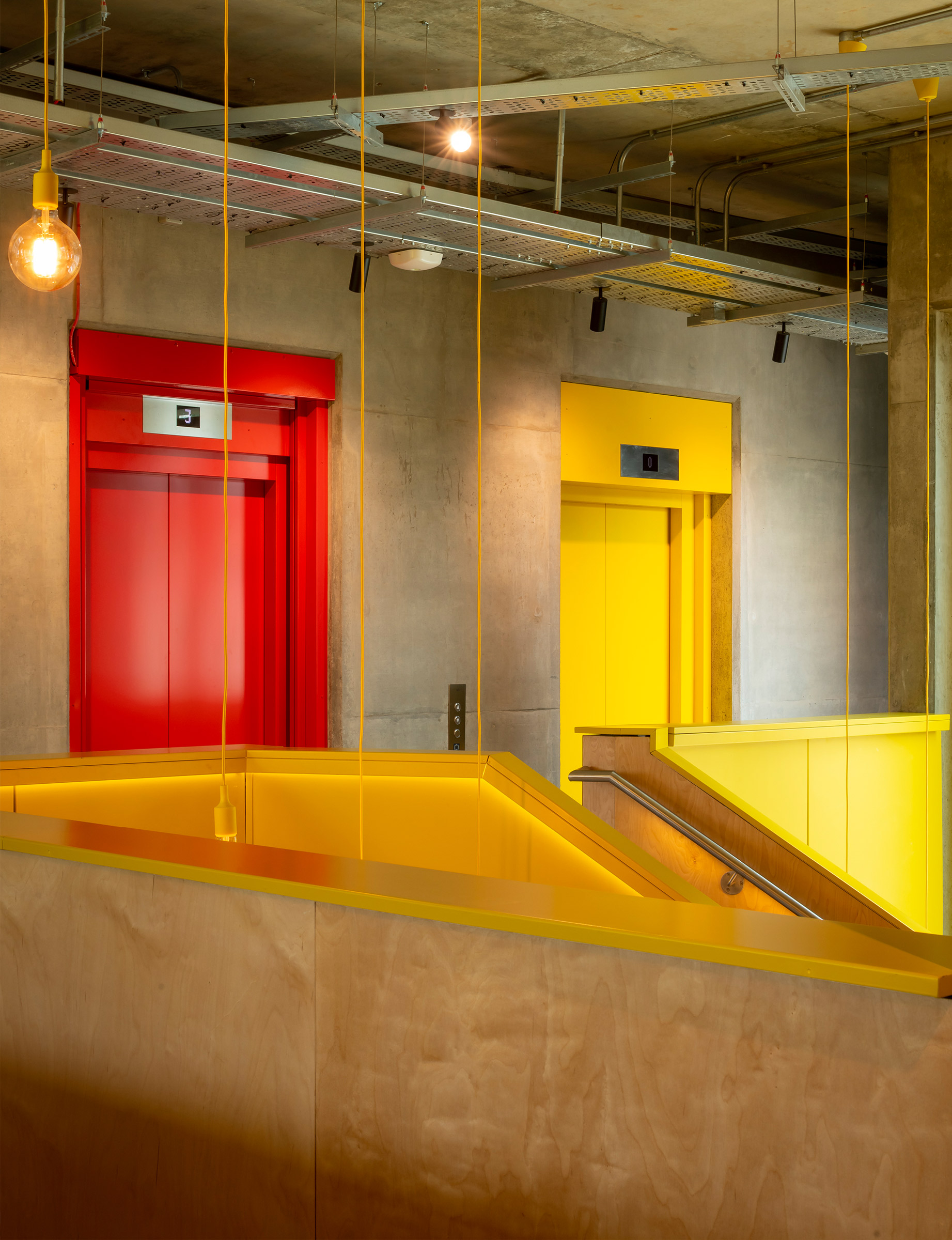 Plus X Brighton is the first of several localized national innovation hubs across the United Kingdom aiming to transform under-utilized spaces and buildings to support Britain’s new generation of entrepreneurs and inventors. Comprising a number of flexible working spaces, Plus X Brighton involves the transformation of a Georgian army barracks and two adjacent car parks into a much-improved university campus and mixed-use neighborhood.
The neighborhood outreach program team says of the project: “Adopting a contemporary and layered aesthetic that reflects the dynamic nature of Plus X Brighton, the bright and open yellow façade hints to the open exchange of knowledge and vibrant activity of the spaces inside.”
TONY FRUIT OFFICE
By TAA Design, Ho Chi Minh City, Vietnam
Jury Winner, 10th Annual A+Awards, Office – Low Rise (1-4 Floors)
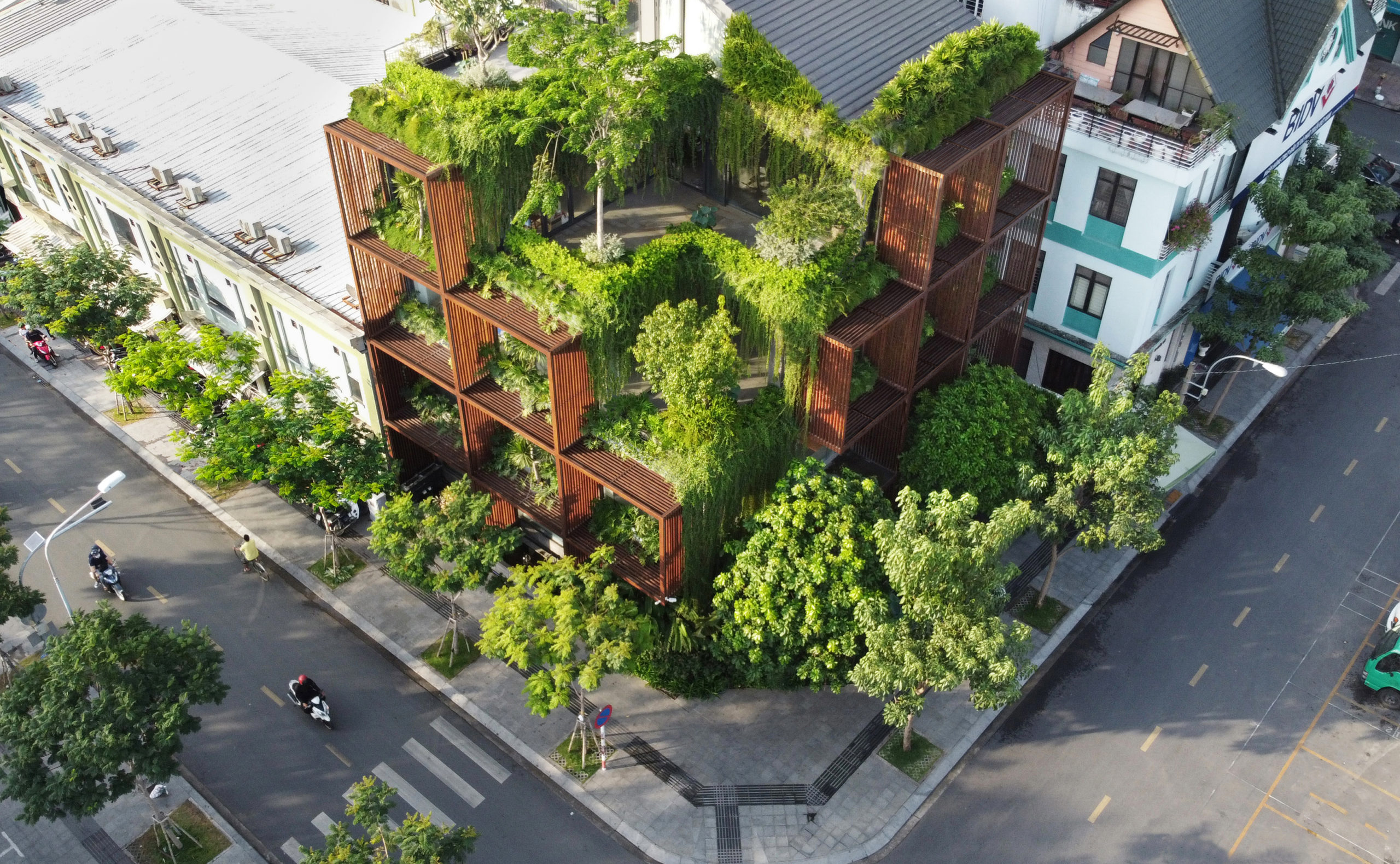
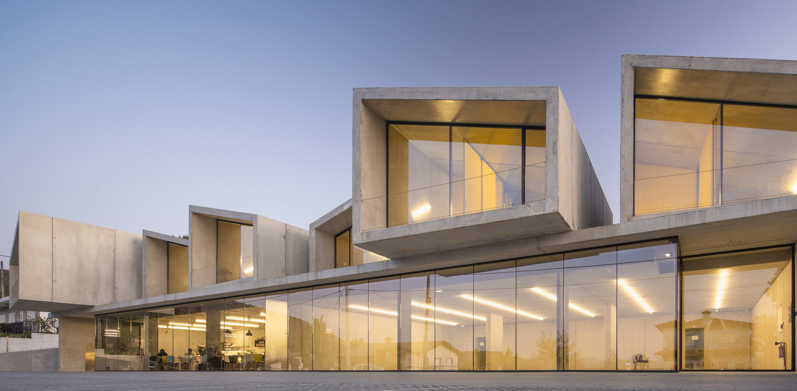
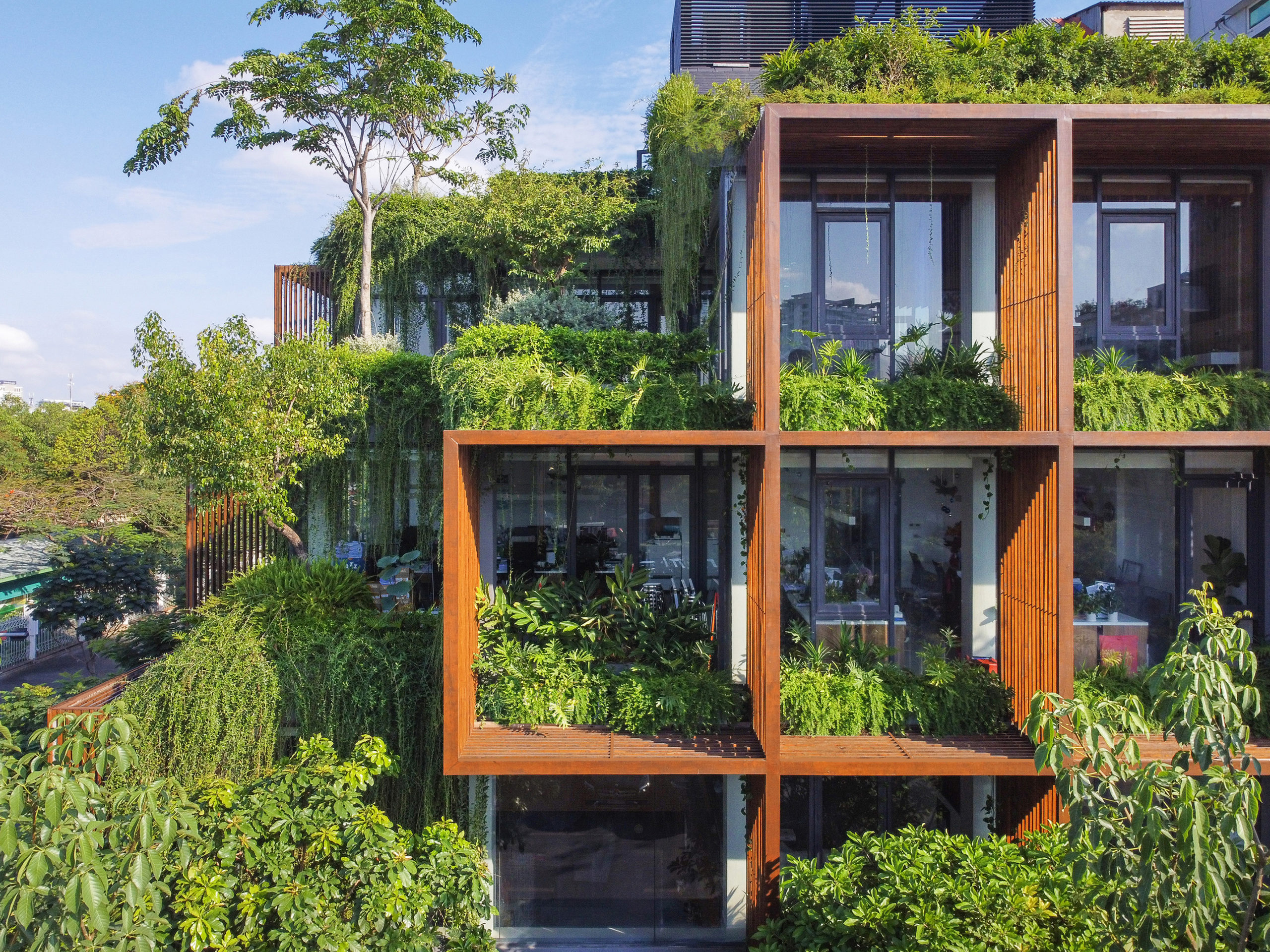 Sometimes nature can give us the finest color pallets. TAA Design showcases the beautiful colors of the natural world in their design for Tony Fruit Office while also combatting the severe problem of overheating within the building. The perforated rust facade creates natural framing and shading for the internal structure, which receives direct sunlight on two sides from morning until evening. This outer “skin” creates a series of platforms used for plant life which additionally protects the building and positively impacts the individuals working within the structure and those experiencing it from the exterior.
Café Camaleón
By GRAS Reynés Arquitectos and MVRDV, Berlin, Germany
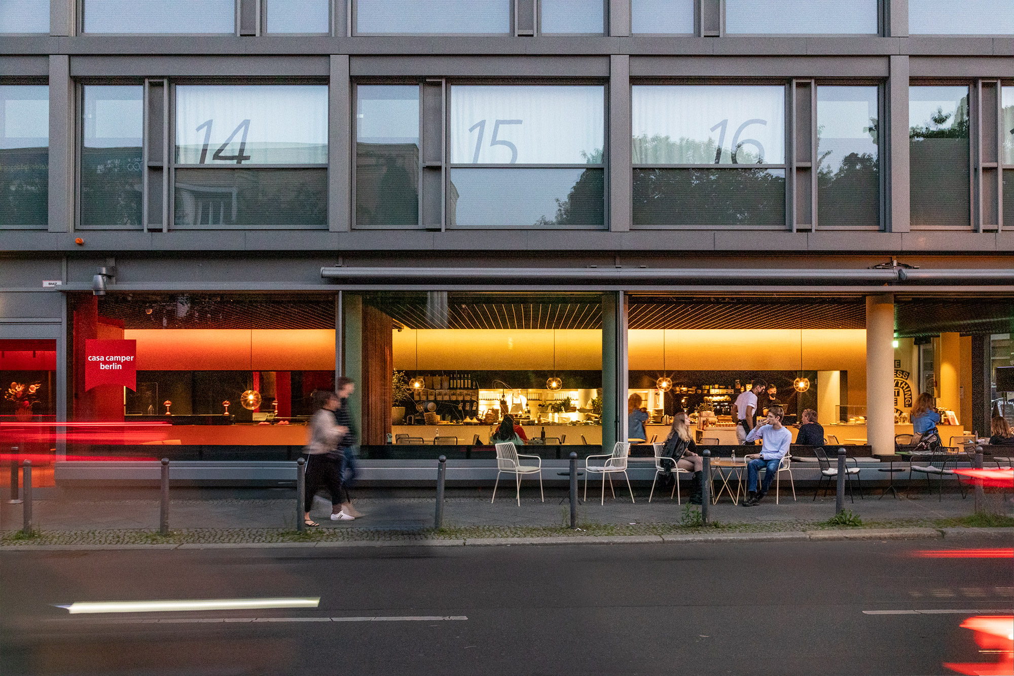
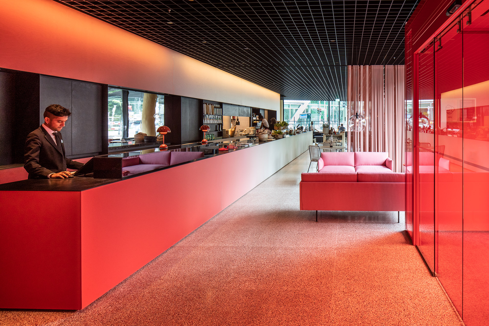 Café Camaleón received a special mention in this year’s A+Awards. Occupying the ground floor of the Casa Camper Berlin – the second hotel developed by Mallorcan shoe brand Camper – Café Camaleon combines a hotel lobby, restaurant, and retail showcase in one entity. The beautifully designed space uses color to take visitors on a journey. Each space function was assigned a color: red for the hotel lobby, white for the retail showcase, and brown for the restaurant.
To express an interaction between the different programs, the color graduates across the length of the space and is applied to all faces for optimal impact. These vibrant colors inspired the project’s name, Camaleon, as the area’s appearance will vary depending on the vantage point. Camaleon also references the brand’s first shoe from 1975, the Camaleón.
Qiao Shao Wan Contemporary Art Center
By Origin Architecture, Shanghai, China
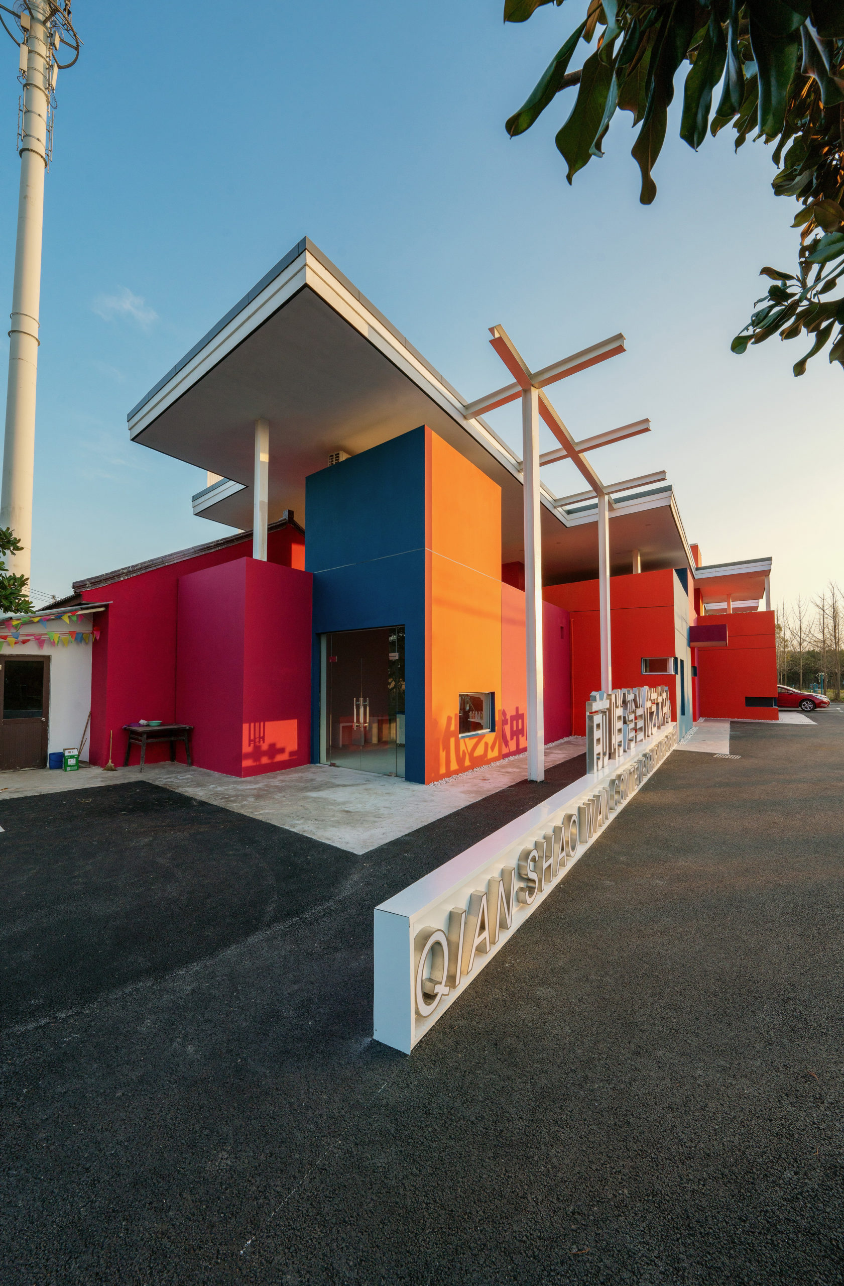
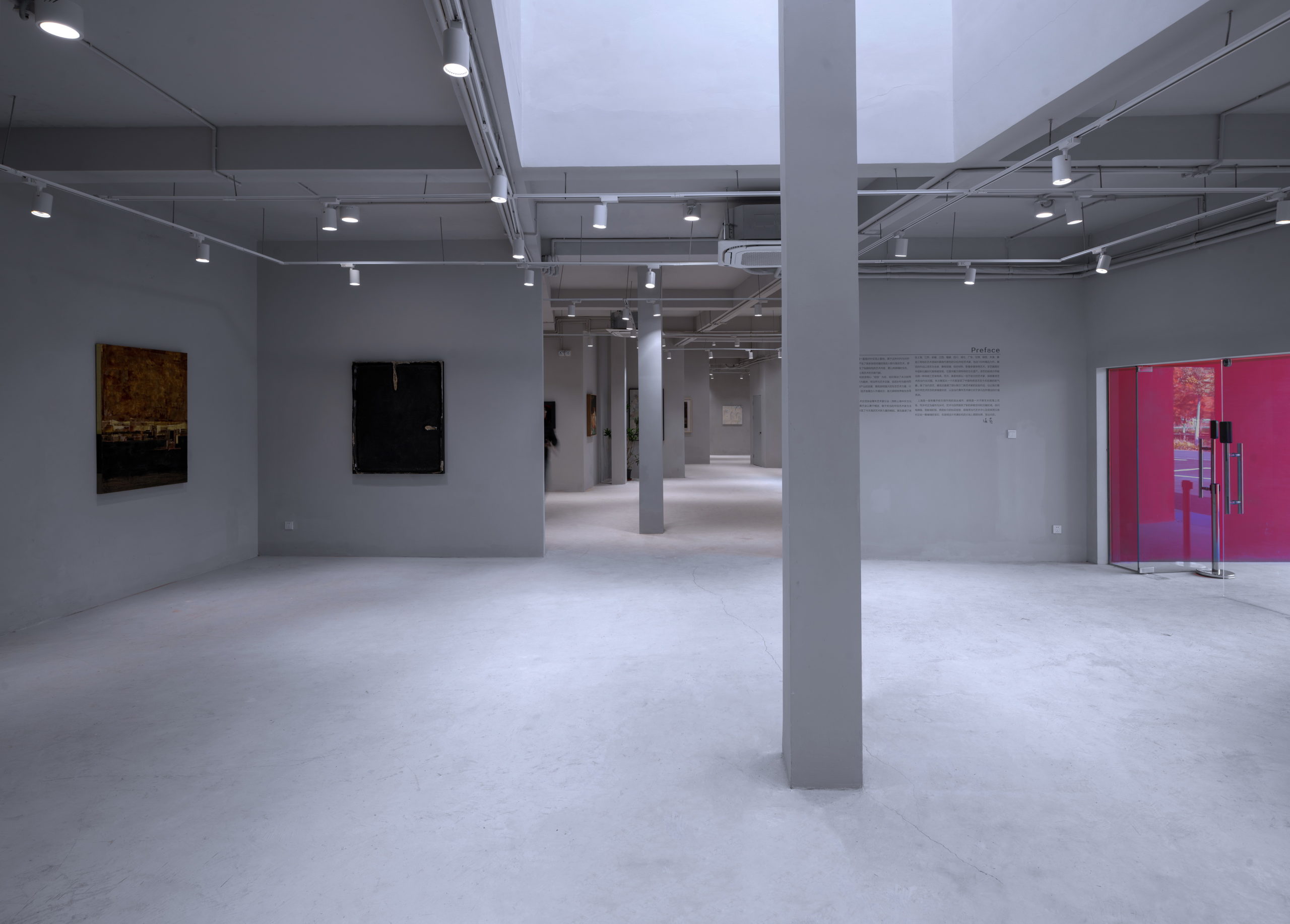 Qiao Shao Wan Contemporary Art Center is a peculiar shaped building that uses its unusual shape to its advantage. Internally it comprises multiple spaces for showcasing artwork on pristine white walls and concrete floors. The exterior, however, is immensely bold, using paint colors on various faces of the facade to bring richness to the building’s form. The changing sunlight throughout the day shifts and transforms the appearance of the building, providing attendees with a unique experience each time they visit.
Church of Beatified Restituta
By Atelier Stepan, Czechia
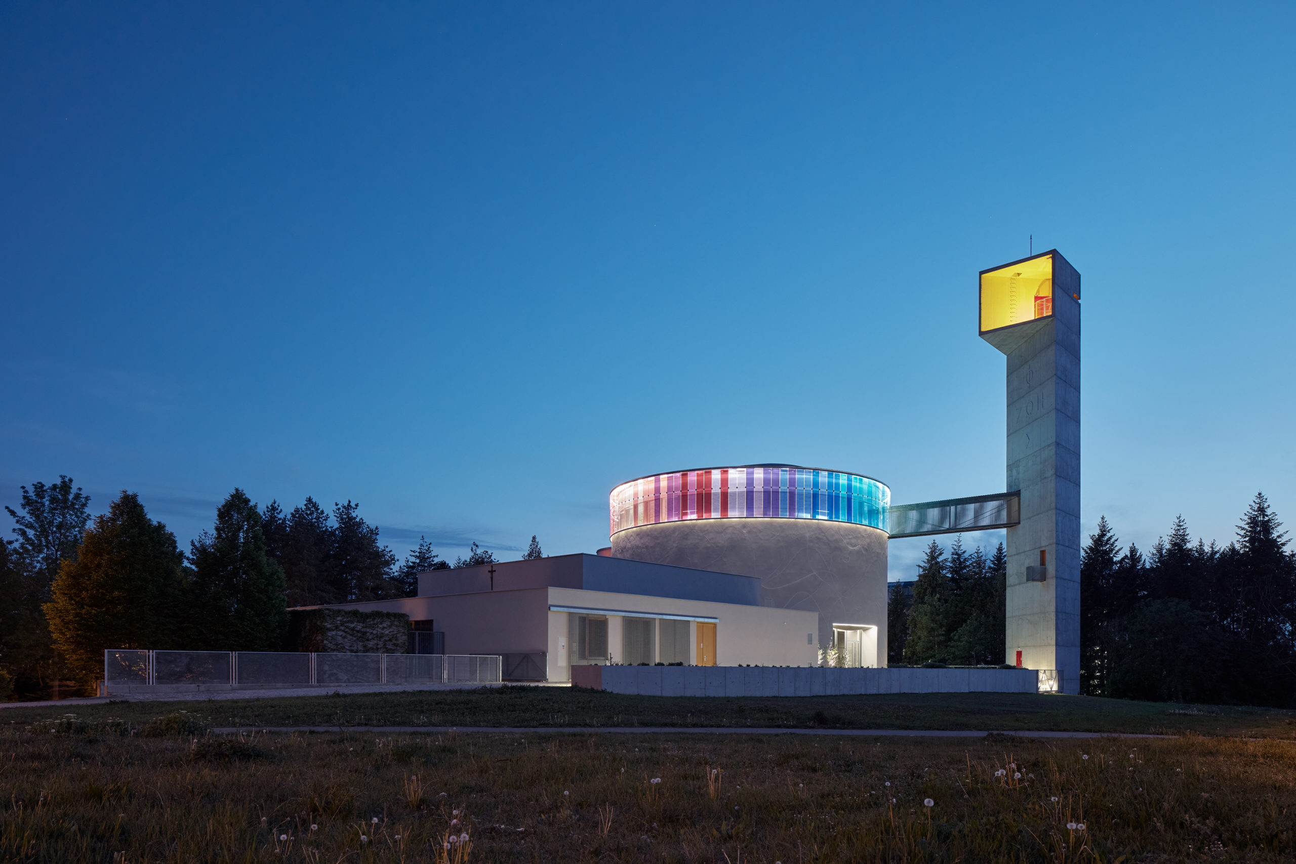
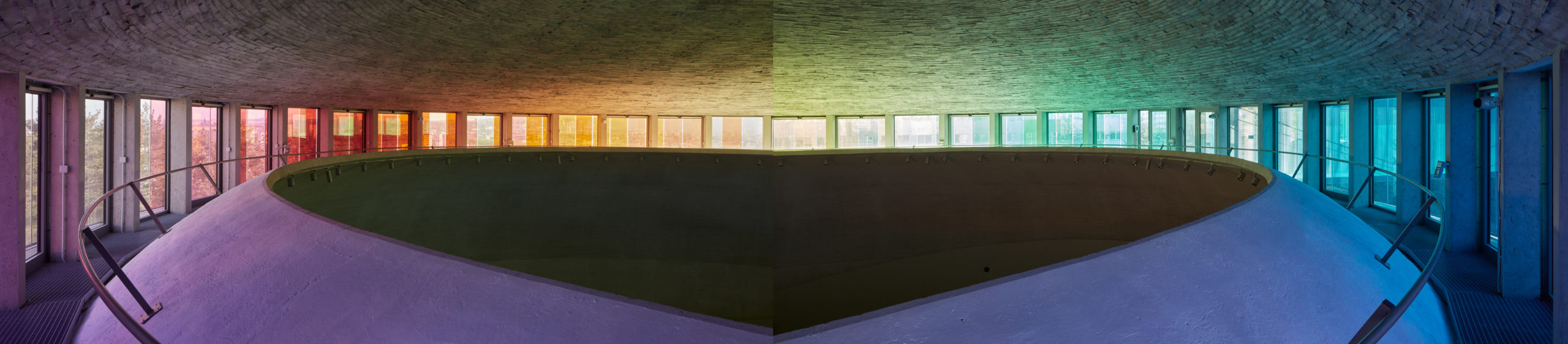
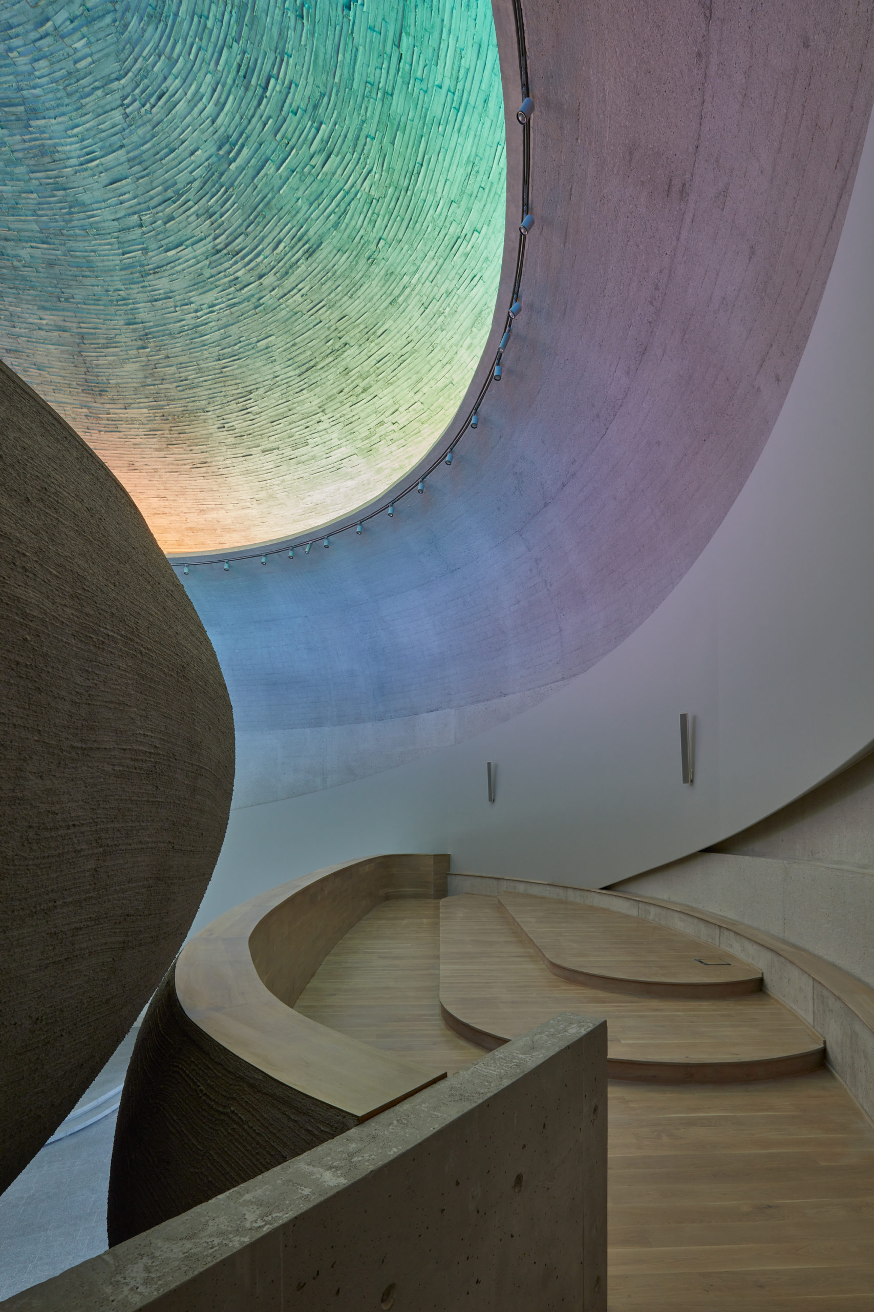 Within The Church of Beatified Restituta, Atelier Stepan has used color as an interactive object instead of a surface finish. Although predominantly grey and concrete, the religious building has a lantern at the top of its cylindrical mass. The soft and austere curves of the building create an interior space that is a vast theater. The church is ethereal, further formed by light from the upper annular window encircling the church under the edge of the roof.
The 260-foot-long (80-meter-long) window gradients in the shades of a rainbow that are intended to symbolize God’s people’s covenant with the Lord. The diffused light is the building’s most fundamental symbol and bears almost a supernatural character. Consciously and unconsciously, the church’s light depicts the world’s existence beyond the material reality.
AN VILLA
By TROP: terrains + open space, Shaoxing, China
Jury Winner, 10th Annual A+Awards,Private Garden
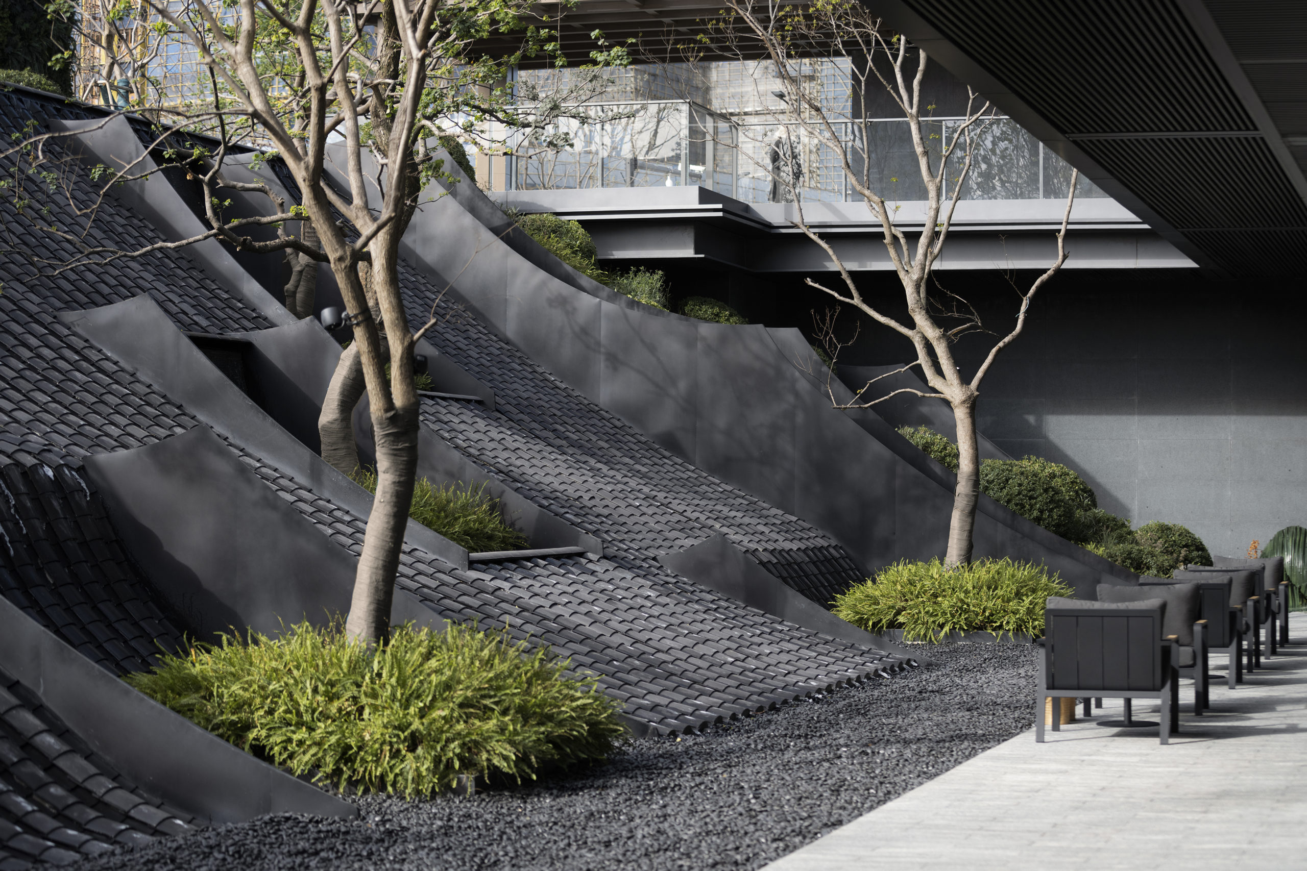
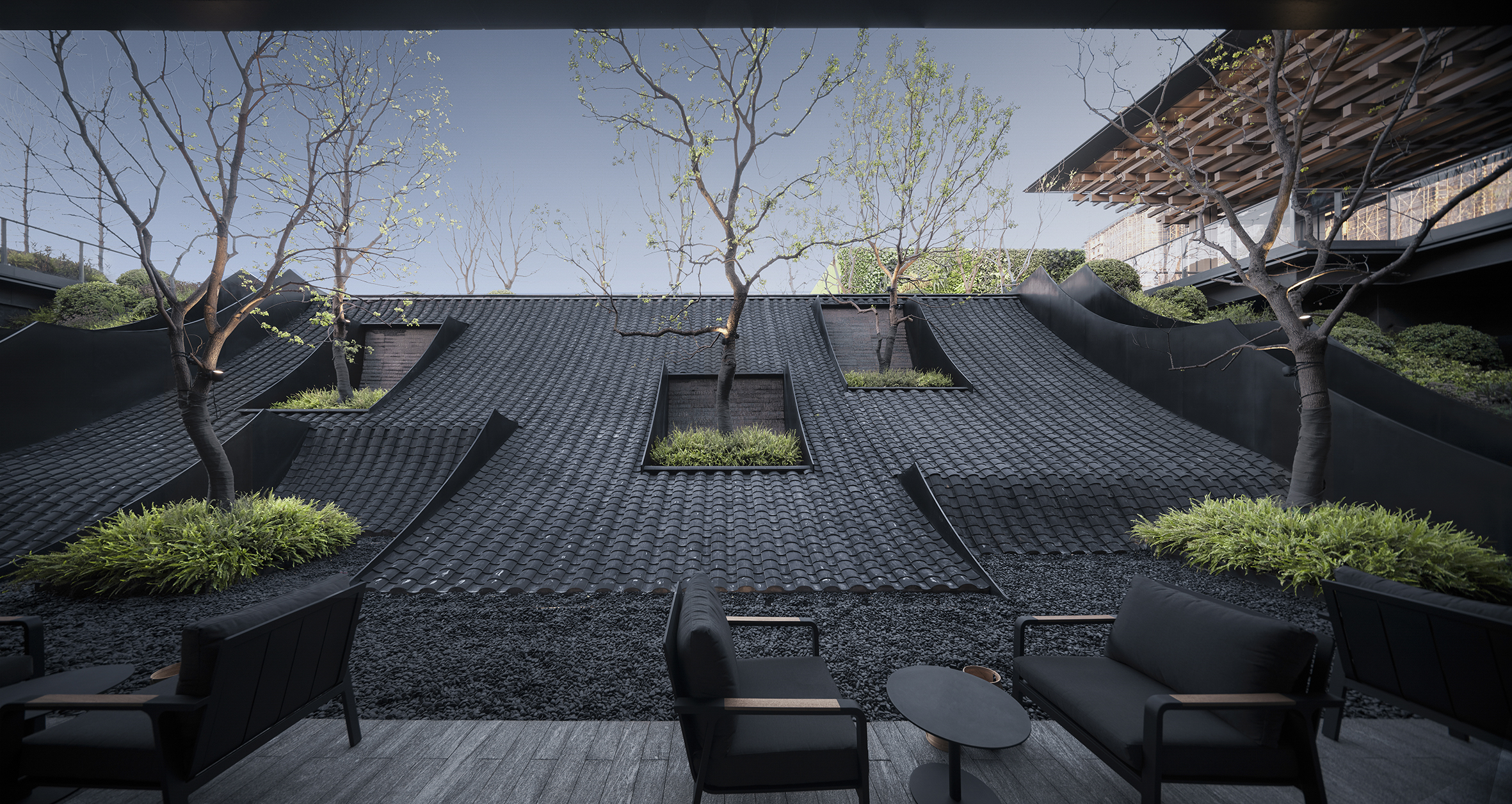 Finally, most would call black the absence of color; however, when used for architectural purposes, black can be many shades. Deep blues, rich greens and earthy browns are all perceived in the spectrum of black by the human eye. AN VILLA captures black as a tone perfectly. By using texture, form and light to create shadow and contrast, TROP allows us to see not only black but many shades of the darkest colors on the spectrum. The outdoor space uses plant life in bright greens and the reflective properties of water to further heighten the richness of the terrace.
Wallace Walk Studio
By Workshop, Toronto, Canada
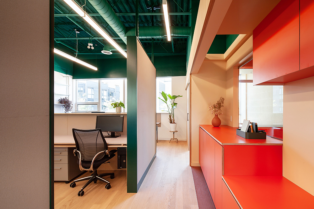
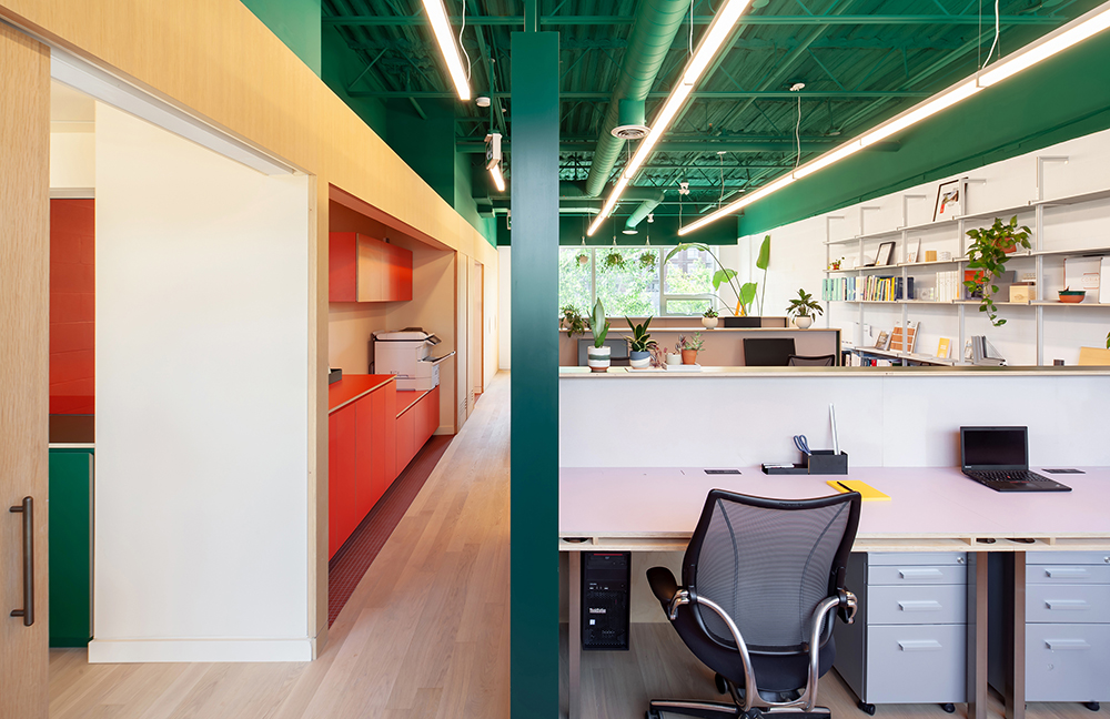 Wallace Walk Studio embraces color in a welcoming, comfortable and practical workspace, using a mix of natural textures, unique color arrangements and an abundance of plant life. The design uses seemingly simple materials with well-considered and executed details throughout. Color blocking has been used expertly in the Canadian office, creating a layered appearance that explores pigment and texture on its multiple planes. The result is a fascinating journey between defined zones.
Daley College: Manufacturing, Technology and Engineering Center
By CannonDesign, Chicago, IL, United States
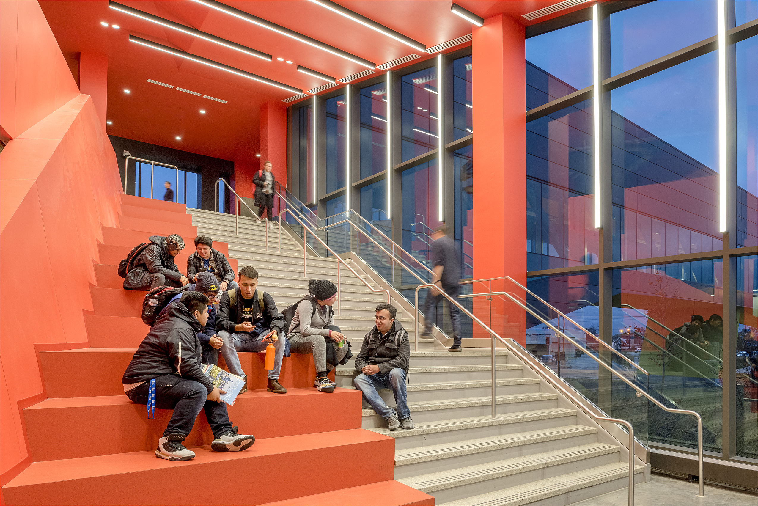
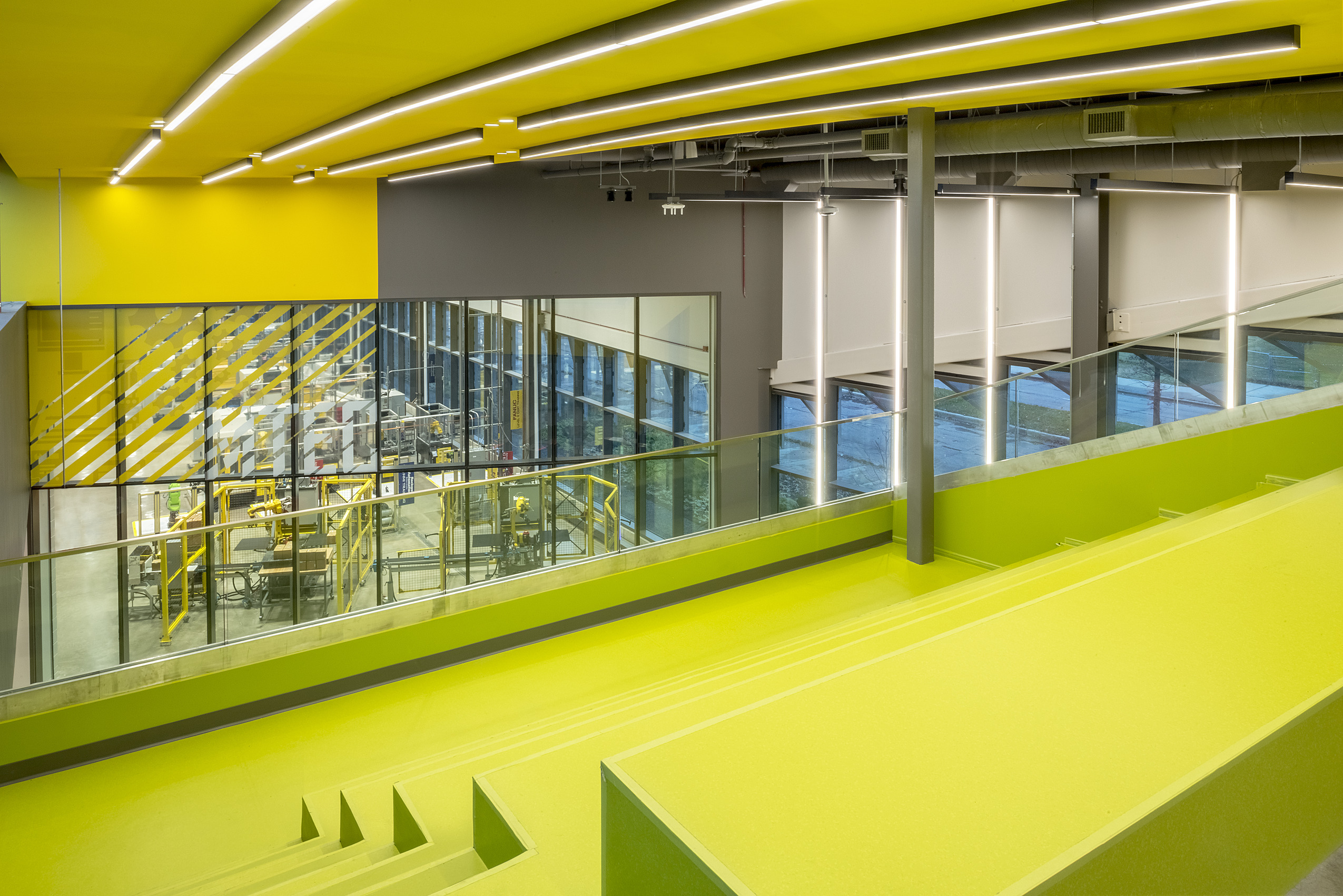 MTEC is designed to serve as a focal point and connector to the existing college in Chicago. The brightly colored college connects to the Richard J. Daley campus via a footbridge whose underside is painted caution tape yellow. The new educational center includes an expansive high-bay manufacturing space, six labs, four classrooms, administrative offices and communal areas for students that aim to provide the skills and training needed for highly specialized, technology-oriented careers.
Circulation spaces inside the building intentionally collide with seating areas, platforms, and alcoves to encourage students to congregate and participate in learning between peers. The bright pops of color seen throughout the building in scarlet, orange, lime and yellow emphasize the boldness of what the college is trying to achieve with its academic program while simultaneously providing students with engaging spaces they want to interact with and be proud of.
Architects: Want to have your project featured? Showcase your work through Architizer and sign up for our inspirational newsletters.


 Plus X