

So what would Root have used as his theme or concept for the design of the exterior of the Masonic Temple?
1. This was not just another speculative office building like the Rookery. It had a very special client that needed to be architecturally symbolized, much like the Woman’s Temple.
2. This was planned to be Chicago’s tallest building. It would be seen from almost everywhere, therefore, it deserved a “unique,” specifically-designed top that would complete it, rather than a flat roof like how he had topped the Chicago Hotel.
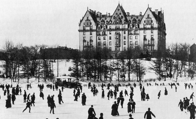
3. The first time I saw this photo of The Dakota in Robert Stern’s book New York 1880 I immediately understood Root’s design for the top of the Masonic Temple. Once again, and by now this should seem to you to be a recurring theme: Root was using a New York building, however this time not designed by George Post, as his inspiration for another of his designs of a Chicago building. (If you want to review this point, please refer to v.6. sec.1.4.)
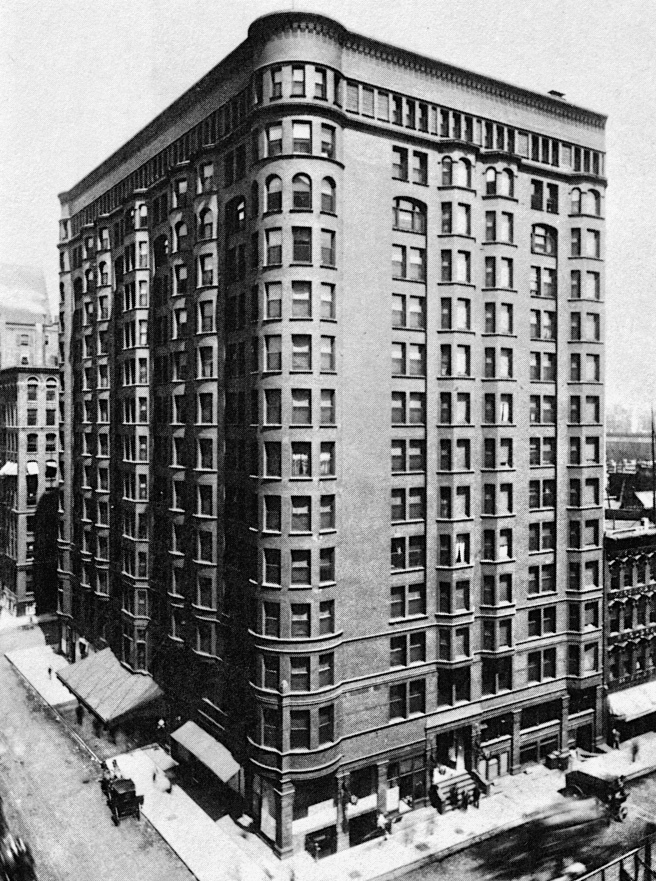
4. Because of its height, the building’s construction would be steel framing. As opposed to the Chicago Hotel, whose rooms didn’t require the same amount of daylight, this building was to have not only offices, but also shops that also required a maximum of daylight, i.e. large windows.

Therefore, Root had no alternative for the overall language of the building but to minimize the size of the column coverings to maximize the size of the windows.(Hoffmann included an interesting detail: he stated that the columns’ masonry cladding was not supported on the frame at every floor but only at three points: the ground, the fifth story, and the 16th story.) Root could have either covered the entire twenty stories with one continuous surface, like he did with the Chicago Hotel and Monadnock, and then carve in it as large of windows as possible, or he employ the pier-and-spandrel language of a number of his previous designs. From the final design of the elevations, Root had made the decision to emphasize the building’s verticality by detailing the piers as continuous vertical lines. As one studies the elevational designs of his skyscrapers, the break point for him in designing either a balance of horizontals and verticals versus an unashamedly vertical elevation appears to have been 14 stories (Monadnock and the Chicago Hotel using their bay windows, and Masonic Temple with its unbroken piers). In all his other shorter skyscrapers (including the Mills Building in San Francisco that came after these three), one finds Root trying to achieve a repose between the vertical and horizontal lines in the elevation. But once a building was at least 14 stories, it seems Root felt that such a repose was unachievable with these taller proportions and simply decided to celebrate the height of the building. It was finally time to meet Buffington on his own ground: the piers of the Masonic Temple would be unleashed and the spandrels correspondingly recessed so as to create a vertical rush to the top similar to how the unbroken bay windows in the Monadnock Block read.

This did not, however, mean that Root had to apply the pier-and-spandrel language equally across the face of the building. This is where the art of composition came into play. Similar to the Woman’s Temple, the Masonic Temple’s plan was a U-shape: two parallel wings linked by the State Street front. In addition to the plan, the Masons’ major halls were to be located on top of each of these wings. Root expressed the location of these halls with a 60° gable roof. Rather than turning the corners of the building with this roof as he had done it the Woman’s Temple, however, he extended the front wall so that it intersected the gable roofs, not only expressing the structure of the trusses spanning the halls, but also forming an equilateral triangle, one of the symbols of the Masons (more on this later). He had achieved a triple synthesis in this design: function, design/massing, and symbol: rare indeed, and underappreciated by critics. The gables defined the widths of the wings of the U-plan that Root expressed in the façade by recessing the remaining central piece of the façade, creating in essence, corner pavilions, his favorite elevational compositional technique (every skyscraper he designed, with the exception of the Calumet had thickened corners. In this category I include the curved corner bays of the Chicago Hotel and the Woman’s Temple). Each corner pavilion he then further defined with wider corner piers at each side (the widened interior piers also expressed where the lines of windbracing were located). within which he then set an arcade (three arches in the corner pavilions, five between the bookend corner pavilions.


Root detailed the first three floors as an appropriately–scaled base for such a tall building, sheathing it with a gray granite. He might have been able to get away with only a two-story base, but the dimensions of the entry arch were such that after Shankland had calculated the size of the transfer beam need to carry the seventeen floors above it, Root needed a third floor of granite to integrate the blind arcade above the arch that he used to hide the beam. As in all his skyscrapers, the granite base was not detailed as a wall that met that ground but a series of piers, once again expressing the fact that this building was built with a steel frame and not a bearing wall.
The upper seventeen floors were enclosed with a matching mottled gray brick brick curtain wall that Root articulated into a 13-story arcade, a transition floor, and then a three-story top. The lowest floor (floor 4) of the arcade was detailed as a transition from the granite below to the unbroken run of eleven stories of brick above with a projected sillcourse that ran around the entire body of the building at the fifth floor, paralleling how Root had detailed the joint between the granite and the brick at the fourth floor. Then came ten repetitive stories with their unbroken vertical piers and recessed spandrels.


In the 14th story Root began to visually slow down the eye with the incremental addition of detail by first starting a thin projected vertical line of bricks in the piers of the 14th story that continued all the way to the top of each arch and then returned back down. Then he added ornament to the spandrels in floors 15 and 16 (the spandrels were unornamented until this point). Finally, the piers were brought to a stop by the arches that had the heaviest brick detailing (i.e., darkest texture and shadow) between the upper edge of the arch and the sillcourse of the 17th floor. And yes, the arched windows had the “proper” tripartite division by mullions.

Before we move to the top of the building, a word about the addition of the bay windows: why? I mean why were they needed? It was already, without such extras, one of the larger floor areas ever constructed. The stores on floors three through ten couldn’t really use them to any advantage. This may explain why there were only three added on the State Street elevation: one in the center of each corner pavilion, and only one meager bay placed in the center bay of the five central arches. In other words, there were eleven bays across the State Street façade, and only three of these contained a bay window. While I can question their value, I can compliment the designer in how he continued the bay windows from the brick body down into the third-floor granite, thereby creating an interlock between the brick and granite that softened, and enriched the joint between these two different materials.

Let’s also have a brief word about the two side elevations before we address the top. As much as the wider piers in the State Street elevation made compositional sense, these same elements had NO COMPOSITIONAL REASON to exist on the side elevations. If I wanted to be an apologist for Root, I might point out that in the side elevations the addition of widened piers “kinda” created corner pavilions on the two side elevations as well… but then this holds only as long as one doesn’t continue looking up to the roof where there is no such corresponding articulation, Oops… This problem is then compounded by the incorporation of the bay windows in this elevation. The “corner pavilions” have an even number (two) structural bays, not three. So, where does one put the bay window without making this “pavilion” look lopsided? Can’t be done. At least there are an odd number of bays across the entire elevation so that the middle bay window is symmetric. But then take a look at the plan and see if he did this same mistake on the north face… Nope, this elevation has its bay windows in each of the pavilions in the opposite side. Of course, you might say, well, nobody is ever going to catch this mistake, because nobody will ever see the two sides at the same time. There is simply no excuse for such carelessness; this is not wit that we expect from Root, this was a simplistic inversion of the bay windows from one side to the other with no reason. This willfulness was and is, inexcusable in architecture, and one must wonder whether this detail was changed after Root was dead? The two side elevations should have been the same: wider piers at both corners as bookends, with seven equal, repetitive arched bays running between these. (As he had done correctly in the State Street elevation and would also do so in the elevations of the Mills Building in San Francisco, his next design.) If bay windows were required, these should have been located in bays 2, 4, and 6, as was done in the north elevation.


With The Dakota’s double-gabled roof motif as his precedent, Root used the triangles at either side of the elevation to symbolically express the building’s owner and occupants: Chicago’s Masonic Order. Given the formal symbols of the Masonic Order, especially the compass and framing square, the triangle, and the Eye of Providence, it would have been natural in Root’s design process to have played with their symbolic potential in this location. Each of the two floors that contained Masonic Spaces (fl.s 17 and 18) were articulated separate from the “skeletal” lower body by being detailed as a horizontal, planar surface into which were carved square-headed windows. Both stories were given an emphatic horizontal accent that not only combined with the arcade to stop the vertical rise of the piers below, but also provided the necessary base and transition to the 50’ tall double-gabled roof. This was especially true at night, when the lit repetitive windows would have created a glowing base for the triangles above, and as the Masons’ meetings typically took place during the evenings, would have signaled to those outside of the Order that a meeting was in session. This is not the first time I have mentioned Root’s use of electric light as a new design medium in the exteriors of his buildings.

The massive 50’ triangles were then further broken with a rectilinear geometry of lines that resulted in the formation of a smaller, central triangle in which a circular window was placed: an abstracted Masonic symbol of the All-seeing Eye of God within the capstone of a pyramid. This symbol was approved for the reverse of the Great Seal of the U.S. in 1782. (This did not appear on the one-dollar bill until 1935.) Is it coincidence that Root has surrounded this triangle along its two upper sides with 13 steps, the same number of layers (13 original states) in the unfinished pyramid in the Seal? It appears that the circle was a glass window that, if so, lighted would have looked down upon the city at night, hovering above the two parallel lines of lit windows of the two Masonic floors.
I also must admit that Root’s conscious thickening of the top two sides (and not the bottom) of the triangular gables, in both their width, but even more so their three-dimensional thickness that Root detailed to extend beyond the surface of the roof in back of it, evokes in my eyes an inverted squaring frame in the Masonic symbol of the compass and framing square that even though it is at a 60° angle, is, coincidentally, the same open angle of the compass. This design was not repeated on the two triangles on the east elevation.

FURTHER READING:
Hoffmann, Donald. The Architecture of John Wellborn Root. Baltimore: Johns Hopkins University Press, 1973.
Hoffmann, Donald. The Meanings of Architecture: Buildings and Writings by John Wellborn Root. New York: Horizon, 1967.
Merwood-Salisbury, Joanna. Chicago 1890. Chicago: University of Chicago, 2009.
Monroe, Harriet. John Wellborn Root; A Study of His Life and Work. Park Forest: Prairie School Press, 1966.
Wolner, Edward W., “Chicago’s Fraternity Temples.” Roberta Moudry (ed.), The American Skyscraper: Cultural Histories. New York: Cambridge University Press, 2005.
(If you have any questions or suggestions, please feel free to eMail me at: thearchitectureprofessor@gmail.com)
