Planning to Paint? Consider This Your “2023 Color of the Year” Cheat Sheet
People often say that painting is one of the quickest and easiest ways to transform a space—just prep, coat, and dry, and you’re done. But the adage comes with fine print: Picking a paint color can be really hard.
With thousands of hues to choose from, figuring out the best shade for a room can feel like an overwhelming exercise—even for decisive folks who choose their meals confidently at restaurants, know exactly what looks good on them at a department store, and never have a problem pinpointing a movie to watch on a Saturday night.
It’s normal to struggle when plucking the "right" color from a rainbow of swatches, which is why brands have sought to narrow the field by announcing their colors of the year. It takes teams of professionals months to select these shades, which are carefully calibrated to satisfy current trends and individual preferences. Read on for their top picks for 2023, and get a head start on that easy, breezy room transformation.
Behr - Blank Canvas
Behr’s color of the year for 2023 is Blank Canvas, a warm white that’s versatile enough for any room in the house.
Erika Woelfel, the vice President of color and creative services at Behr, says that the brand’s pick, Blank Canvas, speaks to the universal need for comfort during a time of global unrest.
"After years of uncertainty, we wanted to deliver a color that would provide a sense of renewal," she says. "Behr’s 2023 color of the year, Blank Canvas, is a hopeful and welcoming warm white with limitless possibilities."
This uber-neutral pick works with just about any shade in practically any room, so you can go bolder with accenting patterns, or more minimal with contrasting textures. As a white, it feels more enveloping than the cooler undertones of its cousins, which has the effect of brightening spaces while still making them feel cozy.
"Blank Canvas is a top choice to tackle any home project, from a bedroom refresh to a complete kitchen remodel," Woelfel continues. "It works nicely when combined with a dark green-gray like Conifer Green, or with a quiet blue-gray like Half Sea Fog. The warmth of Blank Canvas in combination with these tones creates balance in restful spaces, such as bathrooms and bedrooms, or a home office where the goal is work and focus."
Valspar
As part of its 2023 color palette, Valspar selected the orange-y Desert Carnation.
For its colors of the year, Valspar selected a dozen shades found in nature to foster a sense of harmony at home. "Each color in the Valspar palette offers a specific emotional state or quality one may be seeking," says Sue Kim, the brand’s director of color marketing. "Whether you want to feel joy, calm, inspiration, or even restoration, there’s a hue for each mood."
Kim recommends Gentle Violet in a dining room or playroom, the terra-cotta pop of Desert Carnation in offices, and the rich Flora in a bedroom. The colors also play well together, so you can use them to cover an entire space— baseboards, trim, and all. "With these 12 colors, we can build a space of comfort, safety, and joy," she says. "Comfort will continue to be a key design element as we transition into 2023, and these shades offer a soothing environment with nature’s touch inside the home."
Lick
All of Lick’s 2023 colors of the year were inspired by nature.
Tash Bradley, the director of interior design at Lick, also turned to the outdoors as she assembled a palette for the company’s eight colors of the year.
"As we become more and more mindful of the way we treat nature, we predict people will be making more conscious, sustainable decisions about how they design their homes in a way that lasts. Enter conscious ‘slow colors,’" she says. "Simultaneously strong yet subtle, this palette is a curation of colors that will stand the test of time. They’re easy on the eye, inviting, and versatile."
The colors have yellow and pink undertones with a "heavy pigment," Bradley says, giving them a grounding feel. For a kitchen, she recommends Green 05 and Teal 03 for cabinets, with White 06 or Taupe 03 on the walls. For a living area or bedroom, she’s fond of Pink 02 and Beige 03. "For someone with an open floor plan, wrapping a room in either Taupe 03 or White 06 would be epic," Bradley continues. "They’re gorgeous, soft neutrals that really make an open space feel like it’s coming to life."
Benjamin Moore
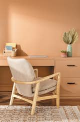
"We are ready to engage our senses in expressive colors that we haven’t seen in several years," says Benjamin Moore’s color marketing director, Andrea Magno. Pictured here is Raspberry Blush.
The team at Benjamin Moore knows how much people want stability, and yet, they also understand that many are tired of the neutral-heavy spaces that have dominated design as of late.
"Despite the softened, organic quality of the colors of years past, we sensed a yearning for saturated color," says Andrea Magno, the brand’s color marketing director. "We think design is headed in a bold direction, and through the color trends 2023 palette, we hope to instill the willingness to take the plunge."
Magno proposes Raspberry Blush, a bright fuchsia, for a dining space, entryway, or a front door. "It balances well with neutrals—particularly White Heron, Etiquette, Gray Owl, and Onyx," she continues. "This is also a great color to pair with a classic navy, such as Hale Navy, or a deep brown like Wenge AF."
Ultimately, though, Magno recognizes that going bold with paint can feel daunting. To that, she says: "Moving back into color may require a leap of faith, but the results will be impactful. Raspberry Blush is also a fun option for painting a side table or a chair, bringing new life to an older piece."
Backdrop
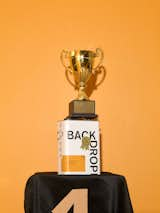
Backdrop’s Color of the Year is inspired by everyday objects. "Color is such a personal choice for each of us," says founder Natalie Ebel.
Natalie Ebel, the cofounder of Backdrop, remembers the brainstorming sessions she had with Coming Soon’s founders Helena Barquet and Fabiana Faria about the industry’s color of the year announcements. They wanted to have a little fun with the practice, so they decided to ruminate on items they loved to create a shade that’s actually called Color of the Year.
"We eventually came up with an orange that is equal parts Bottega Veneta rain boot and the most humble, everyday object: a rubber band," she says. "It’s something you don’t see much of anymore, so why not honor it? We are seeing our customers, particularly millennials, use home decor as a form of self expression, much in the same way they do in fashion. Many of our bestselling colors are also some of our boldest, and ones that connect with our customers on an emotional level."
The playful yellow-orange pairs well with Backdrop’s deep yellow Tan Lines, brighter yellow Pablo Honey, or warm terra-cotta Ghost Ranch, Ebel says. "It’s a perfect autumnal tone and has so much versatility. I feel it can lend a sense of vibrancy and warmth to virtually any space in your home."
Pantone
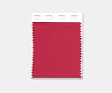
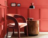
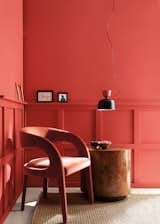
"This is a color that spotlights our need to feel empowered, and infuses us with strength so that we can courageously embrace a new pathway with confidence," says Laurie Pressman, vice president of the Pantone Color Institute.
Pantone has famously announced its pick for many years now—to as much fanfare as debate—and the company’s most recent unveiling was no different.
"Viva Magenta demonstrates a new signal of strength," says Laurie Pressman, vice president of the Pantone Color Institute. "It is an animated red that encourages experimentation and self-expression without restraint; an electrifying shade that is a stand-out statement."
Pressman notes that this color speaks to the times as the other announcements do, but meets societal uncertainty with an "emboldened message." "It’s telling us to find joy, to not take ourselves so seriously, to be true to who we are, and most importantly, to enjoy life," she says.
It can be used as an accent color on a wall, but she also suggests incorporating the shade in smaller doses like stemware, pillows, and throws. If you do put Viva Magenta on your walls, make sure the surrounding colors can hold their own. Pressman recommends pairing with a pink like First Blush, a brown like Roasted Russet, or a darker red like New Maroon if you’d like to stay within the color family—although she also encourages experimentation.
"I don’t know that there are any colors that should be avoided with it, especially keeping in mind that the whole idea is to use color to express yourself," she adds.
Related Reading:
Published
Get the Dwell Newsletter
Be the first to see our latest home tours, design news, and more.