Submitted by Emina Čamdžić
The Influence of Colours on the Human Health
Bosnia and Herzegovina Architecture News - Dec 06, 2023 - 11:18 1060 views
Colours have been widely used in marketing and design for advertising, sales and to evoke emotions and influence human vision and their state of mind. This article, written by World Architecture Community's Bosnia and Herzegovina Country Reporter and architect Emina Čamdžić, shows how positively and negatively do colours influence the human health in the interior and the exterior of buildings.
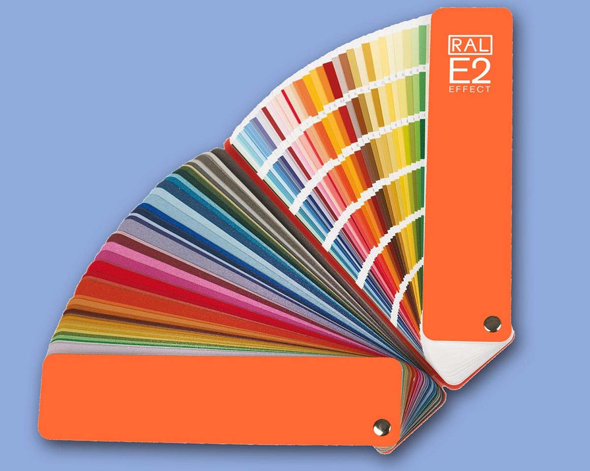
The top image shows the RAL colours palette which is used as a normative standard for choosing paint and other building colours. Most people have heard about the colour palette and complementary colours, then trendy pastel colours. This article focuses only on the basic colours in the buildings exterior and interior and not on the mixture of basic colours. The image below shows the Pantone colours palette solid matte, which is widely used for choosing colours mostly in graphics and therefore such as wallpaper or ceilings paper.
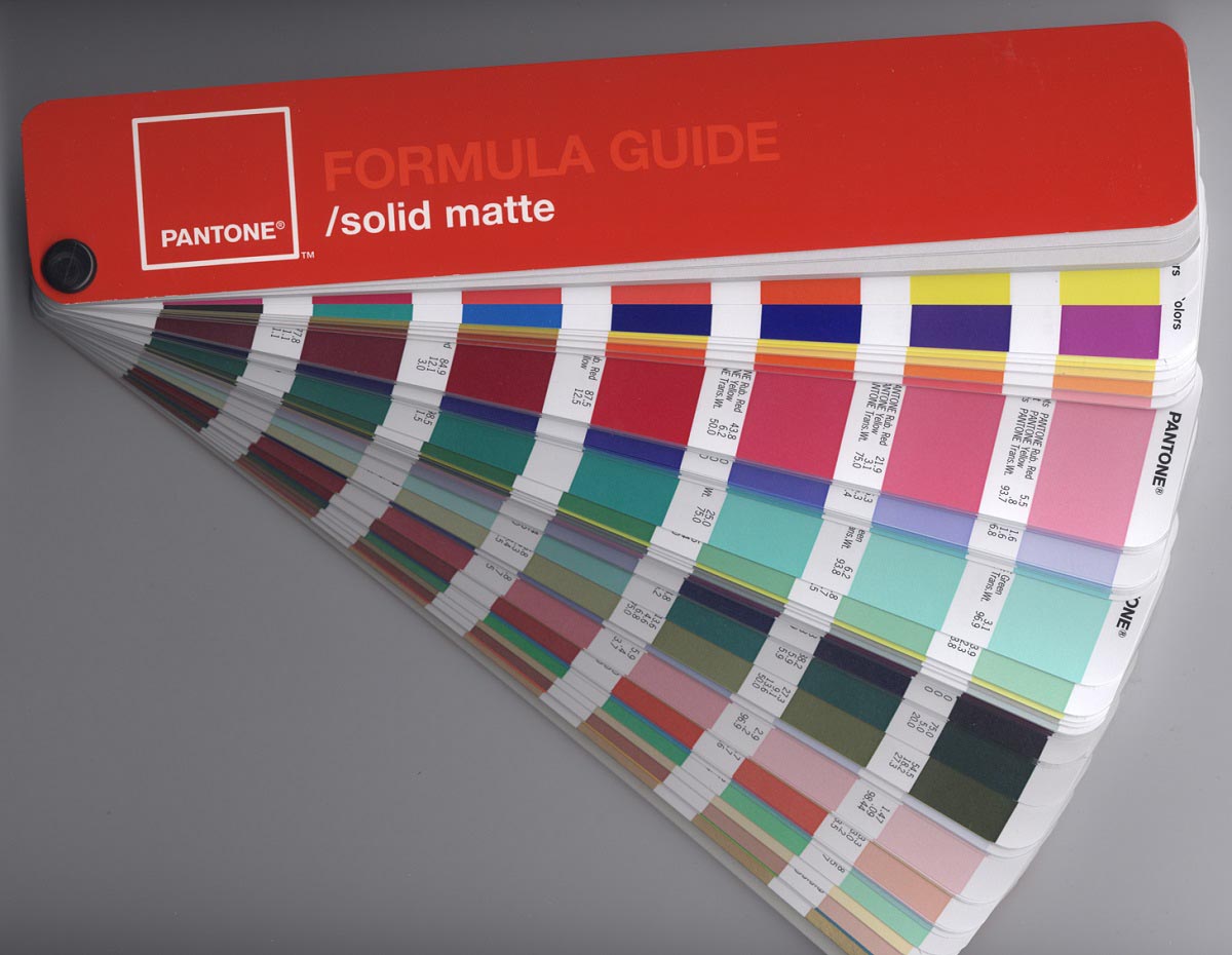
Image shows the Pantone Colours palette. Image © Parhamr1 via Wikimedia Commons
When used in a large scale, the yellow colour is likely to strain eyes while red not only strains eyes further evokes intensity and strong emotions. The blue colour shows calmness and green is connected to nature and tranquility. Orange is used for attention and causes caution, while brown is connected to the soil and nature but also boredom. The grey colour often seems and associates with dirty façades. White is used for spaciousness. There are also more feminnine colours such as purple and pink. To emphasize luxury, wealth and give strong meaning are used colours such as silver, gold, black and white. Therefore is visible that some colours such as black and white can have more meanings depending on the context of the building interior or exterior.
Sometimes it can seem as a marketing in sales, but it is due to what the colours are associated and the feelings they evoke rather then some kind of feeling they should portray. It is said that some colours feel more fresh, present harmony, prosperity, wisdom, serenity and feelings such as happiness, cheerfulness although this are more Zen-like and meditation feelings explanation of colours, while actually this expresses what someone wants a colour to represent for their building and interior and not what is really does express and evoke.
The texture of the materials such as glossiness, roughness and as well saturation of the colours more than just colours, add to the intensity of a certain colour or a colour palette on a building for example: playful, simple, healthy, warm, authoritative or cold environment. There are expressive and dynamic colours which are quite intensive and show strong emotions and dark spaces.
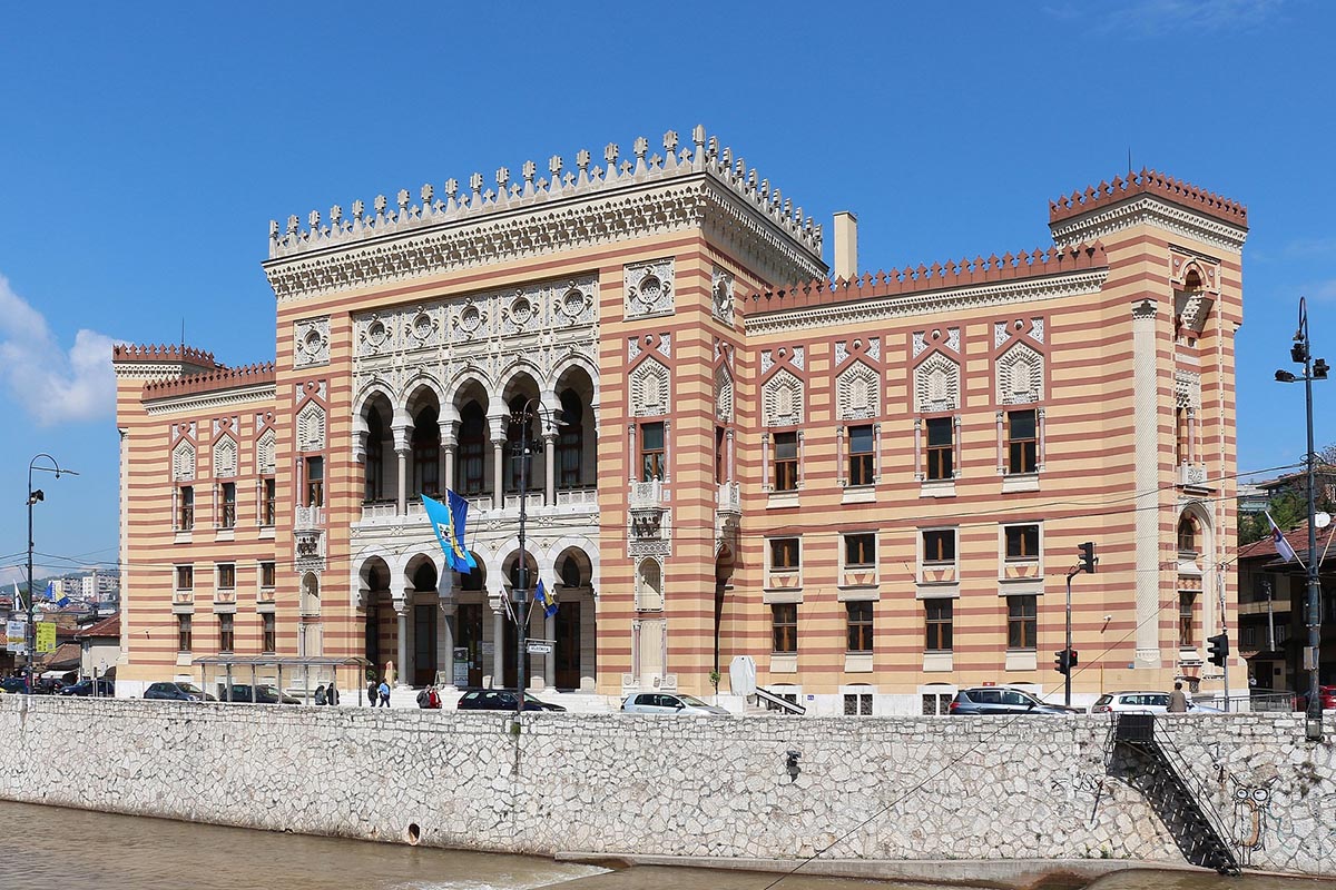
Image of the Vijecnica Town Hall, Sarajevo. Image © Bernard Gagnon2 via Wikimedia Commons
The image shows the Austro-Hungarian building of the Town Hall Sarajevo with exterior façade with some colours that are very strong, dynamic and bright colours that are represented in lines on the building exterior and those are orange-yellow and dark red. The entrance is highlighted in white and beige, as well as the windows upper frame that is playful and the colours are the same as on the entrance. In addition to that, there are vivid yet pale colours as well in the interior of the building which can be seen more about this building on the World Architecture Community. In contrast to the building is the stone wall of the river Miljacka that flows in front of street from the building, yet the colour complements the entrance part of the building.
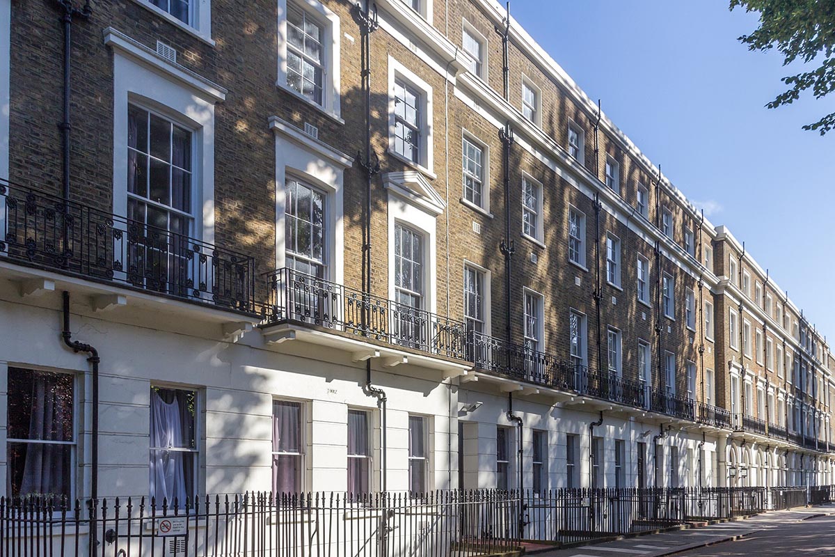
Image of a street in London. Image © Mike Peel3 via Wikimedia Commons
The colours that are represented on the façade exterior of the buildings in London on the image above, show brown on bricks which adds to the colourfulness and texture of that part of the façade and white for the ground floor façade, while all the windows are in white wood and white framing in contrast to the black plumbing, then black fence in front of the buildings and fence on the building terraces. This colour palette shows a harmony of colours that are earthy yet elegant.
Which colours positively influence the human health?
In the exterior any colour palette that has only few colours is good for the human health. Pastel colours are very much used in the interiors, while intensive colours in the interiors are often used and recommended only for people with sight problems. On the façades in the exterior of the buildings, natural colours such as blue, brown, green, white are very calming, warm and stable colours, while adding few cheerful or vivid colours, or just the mixture of the nature's colours with a bit of glossiness and roughness of material texture adds to the feeling of the building. Buildings that have a red angled roof already have a mix of vivid colours, although if the angled roof is dark brown then the building usually has some details such as doors in colours such as green, red, brown, grey, white which emphasize the entrance. Darker tones of any colour further add to the warmth, calmness and natural feeling of the place. The environment of the building is as well very important for the colours selection.
Which colours negatively influence the human health?
First the sight - vision, then the mental health, then also physically tiredness, stress. High saturation of colours, too much glossiness of the glass, shiny wood or metal colours, and the higher intensity of a certain intensive colour such as yellow, red, orange, grey and black can negatively influence the human health such as the sight, further cause stress and physical tiredness. Too many mixed colours can affect the human health through expressive, dynamic vividness or portray places that show less clear vision of what a building represents. These negative influences show that a certain building has not been designed in a proper way because choosing the colour palette should be only the part of the architectural design process.
- Image: Pantone Colours palette. Image by Parhamr. Retrieved 4 December, 2023 from (https://commons.wikimedia.org/wiki/File:PantoneFormulaGuide-solidMatte-2005edition.jpg) via Wikimedia Commons (CC BY-SA 3.0). Copy-Paste into your browser.
- Image: Vijecnica Town Hall, Sarajevo. Image by Bernard Gagnon. Retrieved 4 December, 2023 from (https://commons.wikimedia.org/wiki/File:Sarajevo_City_Hall_01.jpg) via Wikimedia Commons (CC BY-SA 4.0). Copy-Paste into your browser.
- Image: Wilson House, London. Image by Mike Peel. Retrieved 4 December, 2023 from (https://commons.wikimedia.org/wiki/File:Wilson_House,_London_2016_002.jpg) via Wikimedia Commons (CC BY-SA 4.0). Copy-Paste into your browser.
- Top image in the article: RAL colours palette. Image by RAL gGmbH4. Retrieved 4 December, 2023 from (https://commons.wikimedia.org/wiki/File:RAL-E2-Faecher.png) via Wikimedia Commons (CC BY-SA 3.0 DE). Copy-Paste into your browser.